

Showcase layout (stage and roster)
A showcase page puts one item on a stage (its artwork, key facts and one signature chart, such as a radar) and lists every item as a tile in a roster that picks what is on the stage. It scales one composition instead of reflowing in tiers; both strategies are in Layout and responsiveness.
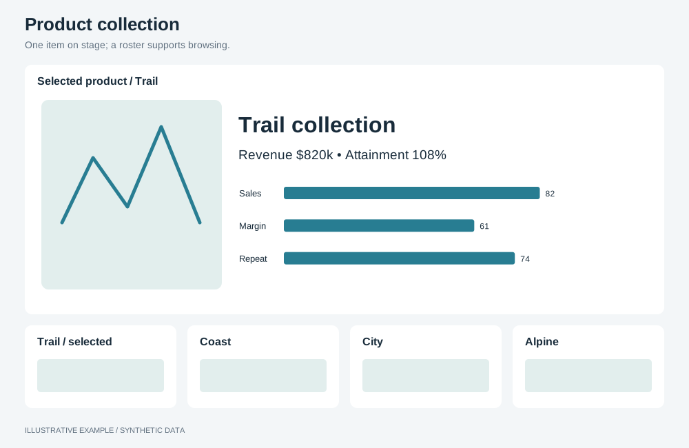
Illustrative example with synthetic data. One item on stage; a roster supports browsing.
When to use a showcase layout
Section titled “When to use a showcase layout”Use it when each item has artwork and readers browse items one at a time, then set two against each other: a product catalogue, player selection, property listings.
| The page is mainly | Use instead |
|---|---|
| Items compared on many measures, with no artwork | Compare page |
| One item picked from a list for data-heavy detail | Master–detail |
| Many items, one metric each | Card grid |
Choose a variant
Section titled “Choose a variant”Compare re-lays the same grid, so offer it as a mode of the single page.
| Variant | Layout | Use cases |
|---|---|---|
| Single | Artwork and key facts, the signature chart beside them, a band below, the roster on the right | Phone catalogue: the render, price and battery life, a radar of camera, battery and display |
| Compare | Item A, the signature chart with both items, item B, a band of differences, the roster along the bottom | Two cars on power, range, price and safety rating |
Shared structure
Section titled “Shared structure”- Draw the page at a reference size and scale it: lengths inside the board are in
rem; see Scale one composition. Keep one breakpoint, where the root font size reaches the clamp’s floor. - Give every row of the stage a fixed height, truncate long names, and show the total in the band’s
heading (
DIFFERENCES 7), so the stage does not move between items. - Pin the roster’s tracks to the full item count; see Grid traps.
- Size each artwork from its subject’s bounds; see Images: fit the subject, not the file. Put the swap animation on a wrapper.
- Read names, scores and colours from the semantic layer. Where items have a colour field, set it
as the figure’s
--accent. - Render each tile as a button and mark the items on the stage with
aria-current="true".
/* Drawn at 1440 × 900: 1.1111vw = 16 / 1440, 1.7778svh = 16 / 900.   The 12px floor is reached below 1080 wide or 675 tall; the 24px cap above 2160 × 1350. */html {  font-size: clamp(12px, min(1.1111vw, 1.7778svh), 24px);}
.board {  display: grid;  gap: var(--gap);}
.showcase {  --roster-w: 22rem;  --band-h: 10rem;  --strip-h: 7rem;  --tile: 7rem;  /* At the 12px floor: 24rem = 288px, above --chart-min. */  --stage-min: 24rem;  gap: 1rem;}.showcase > * {  min-width: 0;  min-height: 0;}.fig--a {  grid-area: a;}.fig--b {  grid-area: b;}.signature {  grid-area: chart;}.band--diff {  grid-area: band;}.roster {  grid-area: roster;}
.fig {  display: grid;  /* Name, artwork, key facts: only the artwork row flexes. */  grid-template-rows: 2.5rem minmax(0, 1fr) 5rem;  gap: 0.5rem;  border-top: 0.25rem solid var(--accent, currentColor);}.fig > h2 {  margin: 0;  overflow: hidden;  white-space: nowrap;  text-overflow: ellipsis;}.fig .art {  position: relative;}.fig .art img {  position: absolute;  inset: 0;  width: 100%;  height: 100%;  object-fit: contain;}
.band--diff {  display: grid;  grid-template-rows: 1.5rem minmax(0, 1fr);  gap: 0.5rem;  min-height: 0;}.band--diff ul {  display: grid;  grid-template-columns: repeat(3, minmax(0, 1fr));  grid-auto-rows: 1.5rem;  gap: 0 1rem;  margin: 0;  padding: 0;  list-style: none;  overflow: hidden;}
.roster {  display: grid;  gap: 0.5rem;  align-content: start;}.roster > button {  min-width: 0;  min-height: 0;}
.board takes its fixed height from Bands above the board.
Single
Section titled “Single”┌───────────┬───────────┬────────┐│ Name │ Signature │ Roster ││ Artwork │ chart │ ▢ ▢ ▢ ││ Key facts │ │ ▢ ▢ ▢ │├───────────┴───────────┤ ▢ ▢ ▢ ││ Band │ … │└───────────────────────┴────────┘<div class="board showcase"> <section class="fig fig--a" aria-labelledby="a-name"> <h2 id="a-name">Item A</h2> <div class="art"><img src="…" alt="…" /></div> <dl class="facts"><!-- key facts --></dl> </section> <section class="signature" aria-label="Attributes"><!-- chart host --></section> <section class="band band--diff" aria-labelledby="band-title"> <h3 id="band-title">Variants 12</h3> <ul> <!-- one item per line --> </ul> </section> <nav class="roster" aria-label="Items" style="--roster-count: 24; --roster-rows: 8"> <button type="button" aria-current="true">…</button> <!-- one button per item --> </nav></div>.showcase { grid-template-columns: minmax(0, 1fr) minmax(0, 1fr) var(--roster-w); grid-template-rows: minmax(0, 1fr) var(--band-h); grid-template-areas: 'a chart roster' 'band band roster';}.showcase:not(.showcase--compare) .roster { /* --roster-rows: the full item count divided by 3, rounded up. */ grid-template-columns: repeat(3, minmax(0, 1fr)); grid-template-rows: repeat(var(--roster-rows), var(--tile)); /* The roster does not size the rows; it scrolls inside them. */ contain: size; overflow-y: auto;}
/* At the 12px floor: 64 + 2 × 16 + 288 + 12 + 120 = 516 */@media (height < 516px) { .showcase { height: auto; grid-template-rows: var(--stage-min) var(--band-h); }}| Width | Stage | Roster | Height |
|---|---|---|---|
| 1080px and wider | Artwork and chart side by side, band below | Column on the right, scrolls inside itself | Fits the window from 516px tall |
| Under 1080px | Stacked | Below the band | Scrolls |
Compare
Section titled “Compare”┌──────────┬───────────┬──────────┐│ Item A │ Signature │ Item B ││ Artwork │ chart, │ Artwork ││ Facts │ A and B │ Facts │├──────────┴───────────┴──────────┤│ Band: what differs │├─────────────────────────────────┤│ ▢ ▢ ▢ ▢ ▢ ▢ ▢ ▢ ▢ ▢ ▢ ▢ roster │└─────────────────────────────────┘Add showcase--compare to the same board and insert item B’s figure. Remove B’s figure in single
mode; the single template has no b area, so a figure left in place lands in an implicit track.
- List in the band only the attributes whose values differ, with their count in the heading.
- A
radarwith a dimension takes exactly one measure, so showing both items needs one row per item and attribute; see radar definitions. - The radar cannot give a named item its own colour or line style; see App limitations.
.showcase--compare {  grid-template-columns: repeat(3, minmax(0, 1fr));  grid-template-rows: minmax(0, 1fr) var(--band-h) var(--strip-h);  grid-template-areas:    'a      chart  b'    'band   band   band'    'roster roster roster';}.showcase--compare .roster {  grid-auto-flow: column;  grid-template-columns: repeat(var(--roster-count), var(--tile));  grid-template-rows: minmax(0, 1fr);  overflow-x: auto;  overflow-y: hidden;}
/* At the 12px floor: 64 + 2 × 16 + 288 + 2 × 12 + 120 + 84 = 612 */@media (height < 612px) { .showcase--compare { height: auto; grid-template-rows: var(--stage-min) var(--band-h) var(--strip-h); }}| Width | Stage | Roster | Height |
|---|---|---|---|
| 1080px and wider | A, chart, B in equal columns, band below | Strip along the bottom | Fits the window from 612px tall |
| Under 1080px | Stacked | Strip below the band | Scrolls |
Pick an item
Section titled “Pick an item”In single mode a pick replaces the item on the stage; in compare mode it replaces item B, and a pick of an item already on the stage changes nothing.
type Stage = { mode: 'single'; a: string } | { mode: 'compare'; a: string; b: string | null };
function pick(stage: Stage, id: string): Stage {  if (stage.mode === 'single') return { mode: 'single', a: id };  if (id === stage.a || id === stage.b) return stage;  return { mode: 'compare', a: stage.a, b: id };}
When the signature chart is a mounted object, write the stage items as a selection on the item field, as in Master–detail.
Decode the next image before the swap animation, and drop a decode that a later pick overtook:
const latest = new WeakMap<HTMLImageElement, string>();
async function swapArt(img: HTMLImageElement, url: string): Promise<void> {  latest.set(img, url);  const next = new Image();  next.src = url;  try {    await next.decode();  } catch {    // Not decodable: set the source anyway so the alt text shows.  }  if (latest.get(img) !== url) return;  img.src = url;  // Start the swap animation on the wrapper here.}
Stack below the breakpoint
Section titled “Stack below the breakpoint”Below 1080px the root stays at its 12px floor, so the columns stack and the page scrolls.
/* 12px / 1.1111vw = 1080px */@media (width < 1080px) { .showcase { height: auto; grid-template-columns: minmax(0, 1fr); grid-template-rows: 30rem var(--stage-min) var(--band-h) auto; grid-template-areas: 'a' 'chart' 'band' 'roster'; } .showcase:not(.showcase--compare) .roster { grid-template-columns: repeat(auto-fill, minmax(var(--tile), 1fr)); grid-template-rows: none; grid-auto-rows: var(--tile); contain: none; overflow: visible; } .showcase--compare { grid-template-columns: repeat(2, minmax(0, 1fr)); grid-template-rows: 30rem var(--stage-min) var(--band-h) var(--strip-h); grid-template-areas: 'a b' 'chart chart' 'band band' 'roster roster'; }}