

Tabs
Tabs switch between views that share one page and its filters, such as Overview, Details and Records. Header tabs sit in a bar below the header; in-panel tabs sit in a card’s title row. Only the selected view is shown and mounted.
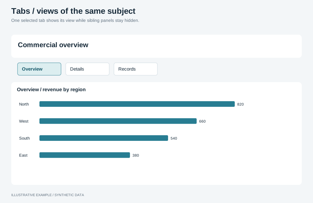
Illustrative example with synthetic data. One selected tab shows its view while sibling panels stay hidden.
When to use tabs
Section titled “When to use tabs”| The page needs | Use |
|---|---|
| Separate pages with their own subjects | Side rail or a hub |
| One chart shown with a different measure | Metric switcher |
| One item opened from an overview | Drill-through |
| Everything visible at once | A layout with more rows, such as KPI-led |
Choose a variant
Section titled “Choose a variant”- Do the tabs change what one card shows, while the rest of the page stays? Use in-panel tabs. Otherwise, use header tabs.
- Should each view have its own address, for Back, bookmarks and shared links? Use links. Otherwise, use ARIA tabs.
| Variant | Where | Common use cases | Choose another variant when |
|---|---|---|---|
| Header tabs | A bar below the header; each tab shows a board | Sales: Overview, Products, Orders. Support: Summary, Agents, Tickets | The views are separate subjects; use a side rail |
| In-panel tabs | A card’s title row; each tab shows one object | A trend as a chart or as a table. Sales by region or by channel | Only the measure changes; use a metric switcher, which keeps one object |
Use two to five tabs, with labels of one or two words.
Markup
Section titled “Markup”ARIA tabs
Section titled “ARIA tabs”<div class="tabs" role="tablist" aria-label="Views"> <button class="tab" type="button" role="tab" id="tab-overview" aria-selected="true" aria-controls="panel-overview"> Overview </button> <button class="tab" type="button" role="tab" id="tab-records" aria-selected="false" aria-controls="panel-records" tabindex="-1" > Records </button></div><section class="tab-panel" role="tabpanel" id="panel-overview" aria-labelledby="tab-overview"> <!-- a board --></section><section class="tab-panel" role="tabpanel" id="panel-records" aria-labelledby="tab-records" hidden> <!-- a board --></section>When each view has an address, the tabs are navigation: use links with aria-current="page", and
no role="tab". Use hash addresses, so switching stays in one document and keeps its selections.
<nav class="tabs" aria-label="Views"> <a class="tab" href="#/overview" aria-current="page">Overview</a> <a class="tab" href="#/records">Records</a></nav>Header tabs
Section titled “Header tabs”:root { --tabs-h: 44px;}
.tabs { display: flex; gap: 4px; /* The border is inside --tabs-h, so the bar is exactly the height the board subtracts. */ box-sizing: border-box; height: var(--tabs-h); overflow-x: auto; border-bottom: 1px solid var(--line);}.tab { display: inline-flex; flex: none; align-items: center; padding: 0 12px; border: 0; border-bottom: 2px solid transparent; background: none; color: var(--muted); font: inherit; text-decoration: none;}.tab:is([aria-selected='true'], [aria-current='page']) { border-bottom-color: var(--accent); color: var(--ink);}Header tabs add var(--tabs-h) to --above-board; set the sum once, as
Bands above the board describes. Add 44px to each height
threshold of the panel’s layout: the 728px example in
Calculate a scrolling threshold becomes 772px.
In-panel tabs
Section titled “In-panel tabs”.tab-card .tabs { --tabs-h: 32px; border-bottom: 0;}Put the tab list in the card’s title row, so it fits the 38px of title and subtitle; see Card. Each panel is an object host in the card’s host cell.
An author display rule on a panel overrides hidden; write layout rules as
.tab-panel:not([hidden]).
Behaviour
Section titled “Behaviour”Keyboard
Section titled “Keyboard”| Key | Action |
|---|---|
| Tab | Moves into the tab list, to the selected tab, then out |
| Left and Right arrows | Move focus to the previous or next tab, wrapping |
| Home and End | Move focus to the first or last tab |
| Enter or Space | Selects the focused tab |
Use manual activation, so arrowing across tabs does not mount every panel. Links use the browser’s own keyboard handling.
Mount only the selected panel
Section titled “Mount only the selected panel”A hidden panel’s objects keep querying; see Hidden means unmounted.
Use that page’s Panel class, one per object. Show the panel before mounting its objects, so each
host has a box.
type Lifecycle = { show(host: HTMLElement): void; hide(): void };type View = { panel: HTMLElement; objects: { panel: Lifecycle; host: HTMLElement }[] };
const tablist = document.querySelector<HTMLElement>('[role="tablist"]');if (!tablist) throw new Error('Tab list not found.');const tabs = [...tablist.querySelectorAll<HTMLButtonElement>('[role="tab"]')];const views = new Map<HTMLButtonElement, View>(); // filled when the page builds its objects
const select = (selected: HTMLButtonElement) => {  for (const tab of tabs) {    const view = views.get(tab);    if (tab === selected || !view) continue;    tab.setAttribute('aria-selected', 'false');    tab.tabIndex = -1;    for (const { panel } of view.objects) panel.hide();    view.panel.hidden = true;  }  const view = views.get(selected);  if (!view) return;  selected.setAttribute('aria-selected', 'true');  selected.tabIndex = 0;  view.panel.hidden = false;  for (const { panel, host } of view.objects) panel.show(host);};
tablist.addEventListener('click', (event) => {  if (!(event.target instanceof Element)) return;  const tab = event.target.closest<HTMLButtonElement>('[role="tab"]');  if (tab && tab.getAttribute('aria-selected') !== 'true') select(tab);});
// After filling `views`: mount the view the markup starts on.const initialTab = tabs.find((tab) => tab.getAttribute('aria-selected') === 'true');if (initialTab) select(initialTab);
tablist.addEventListener('keydown', (event) => {  const index = tabs.findIndex((tab) => tab === document.activeElement);  if (index < 0) return;  const target =    event.key === 'ArrowRight'      ? tabs[(index + 1) % tabs.length]      : event.key === 'ArrowLeft'        ? tabs[(index - 1 + tabs.length) % tabs.length]        : event.key === 'Home'          ? tabs[0]          : event.key === 'End'            ? tabs[tabs.length - 1]            : undefined;  if (!target) return;  event.preventDefault();  target.focus();});
Enter and Space on a focused <button> fire click, so the click listener also handles the
keyboard.
Queries and selections
Section titled “Queries and selections”Selecting a tab costs one query per object in its panel, with the applied selections current at that moment. All panels share the page’s selection group.
Responsive behaviour
Section titled “Responsive behaviour”| Width | Header tabs | In-panel tabs |
|---|---|---|
| Any | Fixed height; tabs that do not fit scroll sideways | In the title row; the title truncates first |