

Header
The header is the first row of every page: brand and title on the left, a scope line saying what the page shows, and page controls on the right. It keeps one height at every width. The rules it follows are in Header and controls.
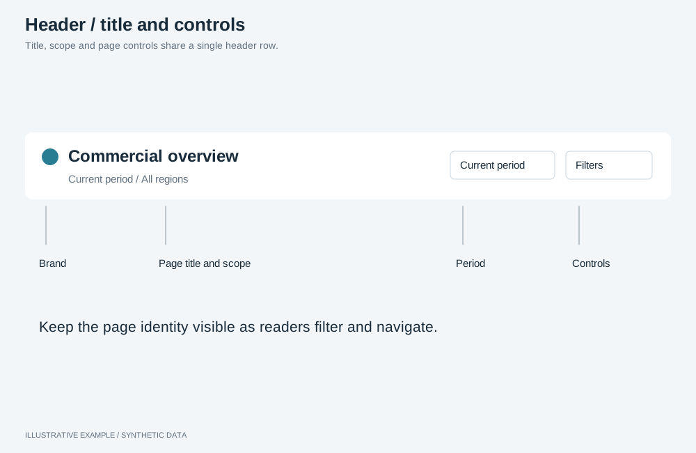
Illustrative example with synthetic data. Title, scope and page controls share a single header row.
Choose a variant
Section titled “Choose a variant”- Does the page switch between sibling pages or views? Use title + tabs.
- Can the reader change the period, filters, theme or export? Use title + controls.
- Otherwise, use title only.
- Does a KPI row open the page, and should it read as one block with the header? Add the backdrop.
| Variant | Contents | Use cases | Choose another when |
|---|---|---|---|
| Title only | Brand, title, scope line | A cover page or hub; an exported report page | The reader needs a period, filters or export |
| Title + controls | Brand, title, scope; period, filters, theme, export | An overview filtered by period and region | The page has sibling pages |
| Title + tabs | Brand, title, tabs, controls | Sales split into overview, regions and products | Tabs and controls do not fit at the narrowest width; use a side rail |
| With backdrop | Any of the above on a band behind the top half of the KPI row | An executive summary opening with four KPIs | The first row is a chart or table |
Markup
Section titled “Markup”<div class="app-top"> <header class="app-header"> <div class="app-header__title"> <a class="app-header__brand" href="./"> <svg aria-hidden="true"><!-- mark --></svg> <span class="app-header__brand-name">Brand</span> </a> <div class="app-header__heading"> <h1>Sales overview</h1> <p class="app-header__scope" id="page-scope" aria-live="polite">Last 12 months · All regions</p> </div> </div> <!-- Title + tabs only: <nav class="app-header__tabs" aria-label="Pages">…</nav> --> <div class="app-header__controls"> <button class="period-trigger" type="button" popovertarget="period-menu"> <svg aria-hidden="true"></svg><span class="control__label">Last 12 months</span> </button> <button class="filters-trigger" type="button" aria-expanded="false" aria-controls="filter-drawer"> <svg aria-hidden="true"></svg><span class="control__label">Filters</span> </button> <button class="theme-toggle" type="button" aria-pressed="false"> <svg aria-hidden="true"></svg><span class="control__label">Dark theme</span> </button> <button class="export-trigger" type="button" aria-haspopup="dialog"> <svg aria-hidden="true"></svg><span class="control__label">Export</span> </button> </div> </header> <!-- the filter bar, if the page has one --></div>.app-top holds the header and the filter bar so both stick as one
block. Keep a label in every control so it keeps its accessible name when only the icon shows.
The header reads --page, --surface, --line and --muted from the style, and the tokens in
Tokens and thresholds. For a header that stays dark in both
themes, use the chrome tokens.
.app-top {  position: sticky;  top: 0;  z-index: 1;  background: var(--page);}.app-header {  display: flex;  align-items: center;  gap: var(--gap);  box-sizing: border-box;  height: var(--header-h);  padding: 0 var(--gap);  background: var(--surface);  border-bottom: 1px solid var(--line);}.app-header__title {  display: flex;  align-items: center;  gap: 12px;  flex: 0 1 auto;  min-width: 0;}.app-header__brand {  flex: none;}.app-header__heading {  min-width: 0;}.app-header__heading h1,.app-header__scope {  margin: 0;  overflow: hidden;  text-overflow: ellipsis;  white-space: nowrap;}/* Two lines, 20 + 16 = 36px, inside the 64px header. */.app-header__heading h1 {  font-size: 16px;  line-height: 20px;}.app-header__scope {  font-size: 13px;  line-height: 16px;  color: var(--muted);}.app-header__tabs {  flex: 1 1 auto;  align-self: stretch;  min-width: 0;}.app-header__controls {  display: flex;  align-items: center;  gap: 8px;  flex: none;  margin-left: auto;}.app-header__controls > * {  height: var(--header-control);}
/* 32 padding + 85 brand + 12 + 160 title + 16 + 399 labelled controls = 704,   + 15 scrollbar = 719. Recalculate with your labels. */@media (width < 720px) {  .app-header__brand-name,  .control__label {    position: absolute;    width: 1px;    height: 1px;    overflow: hidden;    clip-path: inset(50%);    white-space: nowrap;  }  .app-header__controls > * {    width: var(--header-control);    padding: 0;  }}
The title and scope truncate before the controls move. Below the breakpoint the brand shows its mark
only and controls show their icon only; the label stays as the accessible name. If .app-top sits
inside a padded container, cancel the padding with negative margins.
Add a backdrop
Section titled “Add a backdrop”A band runs behind the header and ends half-way down the first KPI row, so the KPI cards sit half on
the band. It is a background on the page wrapper; the DOM does not change. The band’s end is
computed from tokens, so give the KPI row the fixed height --kpi-h.
:root {  --band: #12324f;  --band-ink: #ffffff;  --band-muted: #c3d0dc;  --band-line: #6f8aa3;}:root[data-theme='dark'] {  --band: #1e3048;  --band-ink: #f2f5f8;  --band-muted: #b4c2d0;  --band-line: #6d839b;}
.app--backdrop { /* Header + bands above the board + page padding + half the KPI row: 64 + 0 + 16 + 48 = 128. */ --backdrop-h: calc(var(--header-h) + var(--above-board, 0px) + var(--gap) + var(--kpi-h) / 2); background: linear-gradient(var(--band) var(--backdrop-h), var(--page) var(--backdrop-h));}.app--backdrop .app-top { background: var(--band); color: var(--band-ink);}.app--backdrop .app-header { background: transparent; border-bottom: 0;}.app--backdrop .app-header__scope { color: var(--band-muted);}.app--backdrop .app-header__controls > * { border-color: var(--band-line); background: transparent; color: var(--band-ink);}.app--backdrop .band--kpis { grid-auto-rows: var(--kpi-h);}- Declare
--backdrop-hon the element that holds--above-board, so it reads the current bands; see CSS rules that fail silently. - With a filter bar, the filter objects sit on the band; give them the band colours through their operations.
- Keep the KPI cards’
--lineborder: in the dark theme the card and the band are close in lightness.
| Pair | Light | Dark | Needs |
|---|---|---|---|
--band-ink on --band |
13.2:1 | 12.2:1 | 4.5:1 |
--band-muted on --band |
8.4:1 | 7.4:1 | 4.5:1 |
--band-line on --band |
3.7:1 | 3.4:1 | 3:1 |
Behaviour
Section titled “Behaviour”-
Scope line. Write it from applied state only, and update it on
onActiveSelectionChangeApplied; pending selections belong in the apply bar. Read field keys as in Read selections defensively.// selections and GROUP as in Build an apply bar. describeScope is yours.declare function describeScope(applied: readonly unknown[]): string;const scope = document.querySelector<HTMLElement>('#page-scope');selections.onActiveSelectionChangeApplied(GROUP).subscribe(({ applied }) => {if (scope) scope.textContent = describeScope(applied);}); -
Period trigger. Labelled with the applied period; see Period picker.
-
Filters trigger. Shown only when the filters fold into the filter panel.
-
Theme toggle. See Theme toggle.
-
Export. A menu built as in Object menu, with the page-level items from Data dialogs and exports.
Add ambient motion
Section titled “Add ambient motion”Ambient motion is optional. The header is sticky, so a quiet decorative layer inside it stays in view while the page scrolls. Motion and texture covers the layer, the navigation indicators and how to keep both low contrast in either theme.
Related
Section titled “Related”- Filter bar, Filter panel, Tabs
- Item header: the second header row on a detail page