

Map-led layout
A map-led page gives most of its area to one map; the panels around it summarise or rank what the map shows. Reflow rules, grid traps and the shared tokens are in Layout and responsiveness.
@astrato-io/visualizations has no mountable map type; see
App limitations. The layout below applies to whatever
element draws the map; see Map. Custom map rendering requires the
verification and authorization in Chart rendering policy;
this layout is not permission to substitute a renderer.
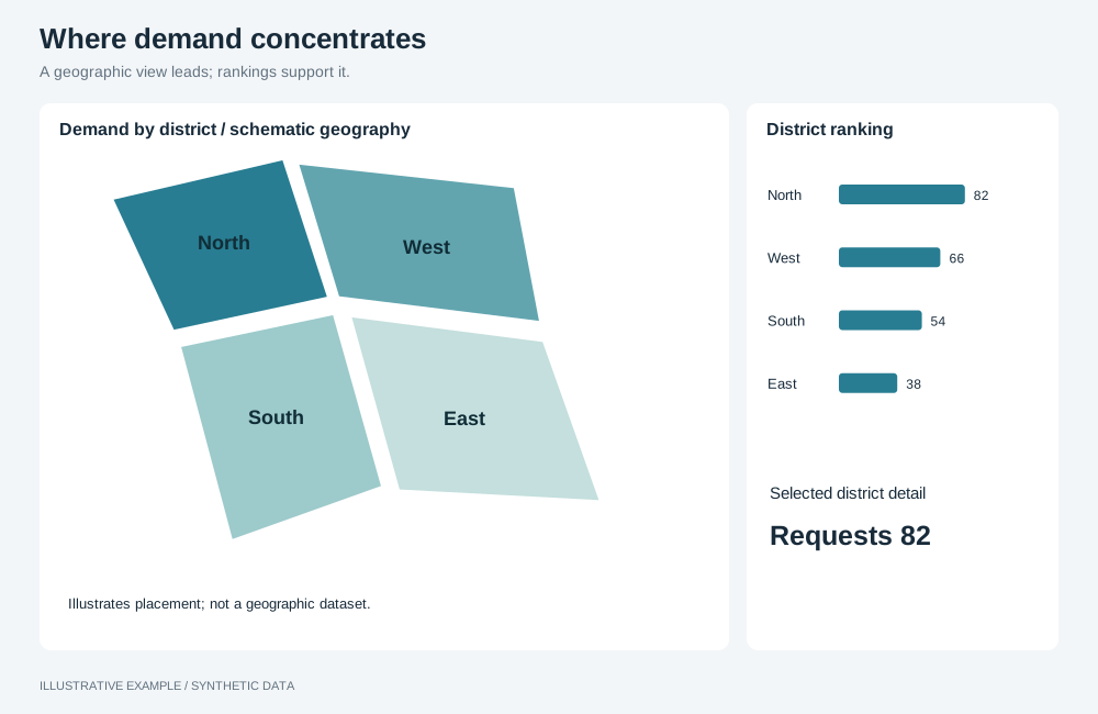
Illustrative example with synthetic data. A geographic view leads; rankings support it.
When to use a map-led layout
Section titled “When to use a map-led layout”Use it when the main question is where: service requests by district, store sales by region.
| The page is mainly | Use instead |
|---|---|
| Headline numbers, with location as one breakdown | KPI-led, with the map as one tile |
| Rows of records to read, sort or export | Table-first |
| One item at a time, picked from a list | Master–detail |
Choose a variant
Section titled “Choose a variant”- Do readers pick places from a ranked list as well as from the map? Use map + list.
- Do a few small panels summarise the map, and does the map need the full width? Use overlay panels.
- Otherwise, use side panels.
| Variant | Layout | Use cases |
|---|---|---|
| Side panels | Map on the left two-thirds, charts stacked beside it | Service requests by district, with requests by type and weekly volume |
| Overlay panels | Map across the board, a narrow column of panels over its right edge | Vehicle positions, with active and idle counts and trips by hour |
| Map + list | Map on the left three-fifths, a ranked table beside it | Stores ranked by sales, with change on last year |
Shared structure
Section titled “Shared structure”- Give the map the full height of the board while the page fits the window.
- On narrow screens, put the map first at a bounded height (
--map-folded), so part of the viewport below it stays scrollable. A map that pans on drag and zooms on the wheel takes those events while the pointer is over it, so a page that is all map cannot be scrolled past it by touch. - Give the map’s host a definite height in every tier; see Give every host a definite box.
:root {  /* 52 + 40 + 10 × 36 = 452: title and padding, header row, ten rows */  --table-min: calc(52px + 40px + 10 * 36px);  /* 60svh leaves 40% of the viewport outside the map; the cap limits it on tall windows. */  --map-folded: min(60svh, 560px);}
.board {  display: grid;  gap: var(--gap);}
.board takes its fixed height from Bands above the board.
Width sums include 15px for a classic scrollbar.
Side panels
Section titled “Side panels”┌──────────────────┬────────┐│ │Panel 1 ││ Map ├────────┤│ │Panel 2 ││ ├────────┤│ │Panel 3 │└──────────────────┴────────┘.board--side { grid-template-columns: minmax(0, 2fr) minmax(0, 1fr); grid-template-rows: repeat(3, minmax(0, 1fr));}.board--side > .map { grid-row: 1 / -1;}
/* Width: 320px panels: 3 × 320 + 2 × 16 + 16 + 15 = 1023. Height: 64 + 2 × 16 + 3 × 252 + 2 × 16 = 884. */@media (width >= 1023px) and (height < 884px) { .board--side { height: auto; grid-template-rows: repeat(3, var(--chart-min)); }}@media (width < 1023px) { .board--side { height: auto; grid-template-columns: repeat(2, minmax(0, 1fr)); grid-template-rows: var(--map-folded); grid-auto-rows: var(--chart-min); } .board--side > .map { grid-column: 1 / -1; grid-row: auto; } /* Three panels in two columns: the first spans the row, so no row is incomplete. */ .board--side > .map + * { grid-column: 1 / -1; }}@media (width < 700px) { .board--side { grid-template-columns: minmax(0, 1fr); }}| Width | Map | Panels | Height |
|---|---|---|---|
| 1023px and wider | Left two-thirds, full height | Stacked on the right | Fits the window from 884px tall |
| 700–1022px | Full width, --map-folded tall |
2 across; the first spans the row | Scrolls |
| Under 700px | Full width, --map-folded tall |
1 across | Scrolls |
Overlay panels
Section titled “Overlay panels”┌───────────────────────────┐│ ┌──────┐ ││ │ KPI │ ││ Map │ KPI │ ││ ├──────┤ ││ │Chart │ ││ └──────┘ │└───────────────────────────┘Place the map and the overlay in the same grid cell, with the overlay after the map in the DOM.
- Give each panel an opaque background.
- If the map fits its initial view to the data, fit it to the part the overlay leaves uncovered.
.board--overlay {  grid-template: minmax(0, 1fr) / minmax(0, 1fr);}.board--overlay > .map,.board--overlay > .overlay {  grid-area: 1 / 1;}/* Keeps the map's own positioned layers inside the map, so z-index: 1 paints the overlay above. */.board--overlay > .map {  isolation: isolate;}.overlay {  display: grid;  grid-template-columns: minmax(0, 320px);  justify-content: end;  align-content: start;  gap: var(--gap);  padding: var(--gap);  /* The map keeps the pointer everywhere except on the panels. */  pointer-events: none;  z-index: 1;}.overlay > * {  pointer-events: auto;  min-height: var(--kpi-h);}.overlay > .chart {  height: var(--chart-min);}
/* Width: the overlay covers at most a third of the map: (320 + 2 × 16) × 3 + 2 × 16 + 15 = 1103. Height: 64 + 2 × 16 + (16 + 3 × 96 + 3 × 16 + 252 + 16) = 716. */@media (width < 1103px), (height < 716px) { .board--overlay { height: auto; grid-template: var(--map-folded) auto / minmax(0, 1fr); } .board--overlay > .overlay { grid-area: 2 / 1; grid-template-columns: repeat(3, minmax(0, 1fr)); justify-content: stretch; padding: 0; } .overlay > .chart { grid-column: 1 / -1; }}@media (width < 700px) { .board--overlay > .overlay { grid-template-columns: minmax(0, 1fr); }}| Width | Map | Panels | Height |
|---|---|---|---|
| 1103px and wider | Whole board | A 320px column over the right edge | Fits the window from 716px tall |
| 700–1102px, or shorter than 716px | Full width, --map-folded tall |
Below the map: 3 KPIs across, the chart full width | Scrolls |
| Under 700px | Full width, --map-folded tall |
1 across | Scrolls |
Map + list
Section titled “Map + list”┌────────────────┬──────────┐│ │ # Store ││ Map │ 1 ... ││ │ 2 ... ││ │ ... │└────────────────┴──────────┘Write a pick from either as a selection on the place field in the one selection group, so each follows the other; see Use one selection group. In the table, a click on a cell in the place column writes that selection.
.board--list {  grid-template-columns: minmax(0, 3fr) minmax(0, 2fr);  grid-template-rows: minmax(0, 1fr);}
/* Width: a 360px list: 360 / 0.4 + 2 × 16 + 16 + 15 = 963. Height: 64 + 2 × 16 + 452 = 548. */@media (width >= 963px) and (height < 548px) { .board--list { height: auto; grid-template-rows: var(--table-min); }}@media (width < 963px) { .board--list { height: auto; grid-template-columns: minmax(0, 1fr); grid-template-rows: var(--map-folded) var(--table-min); }}| Width | Map | List | Height |
|---|---|---|---|
| 963px and wider | Left three-fifths | Right two-fifths, scrolls internally | Fits the window from 548px tall |
| Under 963px | Full width, --map-folded tall |
Below the map, 452px tall | Scrolls |