

Card grid layout
A card grid repeats one card design for each metric or item, so readers compare cards by position. Reflow rules, grid traps and the shared tokens are in Layout and responsiveness.
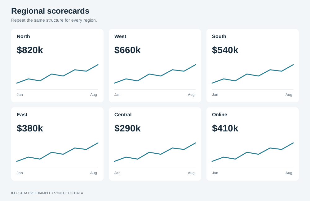
Illustrative example with synthetic data. Repeat the same structure for every region.
When to use a card grid layout
Section titled “When to use a card grid layout”Use it when every tile answers the same question for a different metric or item: a metrics scorecard, or one card per store, product or region.
| The page is mainly | Use instead |
|---|---|
| Headline numbers explained by charts | KPI-led |
| Tiles of different kinds and importance | Bento |
| One item at a time, picked from a list | Master–detail |
| Rows of records to read, sort or export | Table-first |
Choose a variant
Section titled “Choose a variant”- Do the cards fall into categories that readers compare within? Use grouped rows.
- Can a filter change how many cards there are? Use item list.
- Otherwise, use fixed set.
| Variant | Layout | Use cases |
|---|---|---|
| Fixed set | A known number of cards in complete rows, filling the window | Metrics scorecard: revenue, orders, margin, returns, each with a sparkline |
| Item list | As many cards as there are items, as many per row as fit | One card per store with sales, footfall and conversion |
| Grouped rows | One row per category: a label, then the same cards | Utility costs: electricity, gas and water, each with cost, usage, rate and change |
Shared structure
Section titled “Shared structure”- Give every card the same parts in the same order. A card with a missing value keeps its slot and says so.
- Keep one card size per grid. If some metrics matter more, use KPI-led or bento.
- Fetch the values in one query: every measure for a fixed set of metrics, or grouped by the item dimension for an item list; see Query shapes.
- Put the sparkline host in the card’s flexible row, so it has a definite box before mounting.
:root {  /* The narrowest card whose text and sparkline stay readable. */  --card-w: 240px;  /* A 72px sparkline plus 108px for label, value, sentence and padding. */  --card-min: 180px;}
.board {  display: grid;  gap: var(--gap);}.band {  display: grid;  gap: var(--gap);  min-height: 0;}.card {  display: grid;  /* label, value, sparkline, sentence */  grid-template-rows: auto auto minmax(0, 1fr) auto;  min-width: 0;  min-height: 0;}
.board takes its fixed height from Bands above the board.
Width sums include 15px for a classic scrollbar.
Fixed set
Section titled “Fixed set”┌────────┬────────┬────────┐│ Card 1 │ Card 2 │ Card 3 │├────────┼────────┼────────┤│ Card 4 │ Card 5 │ Card 6 │└────────┴────────┴────────┘Choose column counts that divide the card count:
| Cards | Columns, widest to narrowest |
|---|---|
| 6 | 3 → 2 → 1 |
| 8 | 4 → 2 → 1 |
| 9 | 3 → 1 |
| 12 | 4 → 3 → 2 → 1 |
For six cards:
.board--cards {  grid-template-columns: repeat(3, minmax(0, 1fr));  grid-auto-rows: minmax(0, 1fr);}
/* 2 × 16 + 3 × 240 + 2 × 16 + 15 = 799 */@media (width < 799px) {  .board--cards {    grid-template-columns: repeat(2, minmax(0, 1fr));  }}/* 2 × 16 + 2 × 240 + 16 + 15 = 543 */@media (width < 543px) {  .board--cards {    grid-template-columns: minmax(0, 1fr);  }}
/* Each column count has its own threshold, because fewer columns mean more rows. 3 across: 64 + 2 × 16 + 2 × 180 + 16 = 472 2 across: 64 + 2 × 16 + 3 × 180 + 2 × 16 = 668 1 across: 1256, so it always scrolls */@media (height < 472px), (width < 799px) and (height < 668px), (width < 543px) { .board--cards { height: auto; grid-auto-rows: minmax(var(--card-min), auto); }}| Width | Cards | Height |
|---|---|---|
| 799px and wider | 3 across | Fits the window from 472px tall |
| 543–798px | 2 across | Fits the window from 668px tall |
| Under 543px | 1 across | Scrolls |
Item list
Section titled “Item list”The count changes with the data, so an incomplete last row is expected.
.board--items { height: auto; grid-template-columns: repeat(auto-fill, minmax(min(100%, var(--card-w)), 1fr)); grid-auto-rows: var(--card-min);}auto-fillkeeps empty tracks, so two cards stay card-sized;auto-fitwould stretch them across the row.- Fixed-height rows keep every card the same size when a filter removes items.
min(100%, var(--card-w))lets a card shrink below--card-wwhen the board is narrower than one card.- Show a message when a filter leaves no items.
Grouped rows
Section titled “Grouped rows”┌────────┬──────┬──────┬──────┬──────┐│ Elec. │ Cost │ Use │ Rate │ YoY │├────────┼──────┼──────┼──────┼──────┤│ Gas │ Cost │ Use │ Rate │ YoY │└────────┴──────┴──────┴──────┴──────┘Mark up each category as one element with its label and its cards, in the same metric order in every row, so each metric sits in the same column:
<div class="board board--groups"> <section class="band band--group" aria-labelledby="electricity-title"> <h2 class="group-label" id="electricity-title">Electricity</h2> <!-- one card per metric --> </section> <!-- one section per category --></div>:root { --label-w: 160px;}
/* One row per category in the full set; see Grid traps. */.board--groups { grid-template-rows: repeat(3, minmax(0, 1fr));}.band--group { grid-template-columns: var(--label-w) repeat(4, minmax(0, 1fr));}
/* Width: 2 × 16 + 160 + 4 × 240 + 4 × 16 + 15 = 1231 Height: 64 + 2 × 16 + 3 × 180 + 2 × 16 = 668 */@media (width < 1231px), (height < 668px) { .board--groups { height: auto; grid-template-rows: none; } .band--group { grid-auto-rows: minmax(var(--card-min), auto); }}@media (width < 1231px) { /* The label takes its own row above the cards. */ .band--group { grid-template-columns: repeat(2, minmax(0, 1fr)); grid-template-rows: auto; } .band--group > .group-label { grid-column: 1 / -1; }}/* 2 × 16 + 2 × 240 + 16 + 15 = 543 */@media (width < 543px) { .band--group { grid-template-columns: minmax(0, 1fr); }}| Width | Label | Cards per category | Height |
|---|---|---|---|
| 1231px and wider | Left column | 4 across | Fits the window from 668px tall |
| 543–1230px | Above the cards | 2 across | Scrolls |
| Under 543px | Above the cards | 1 across | Scrolls |