

Bento layout
A bento page packs tiles of different sizes and kinds into one board, with no single reading order. Reflow rules, grid traps and the shared tokens are in Layout and responsiveness.
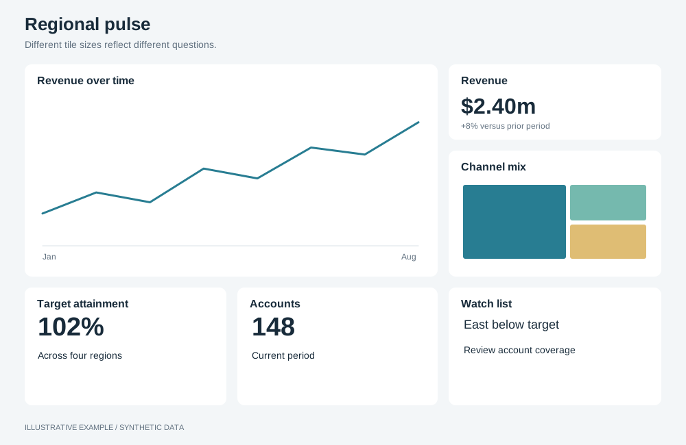
Illustrative example with synthetic data. Different tile sizes reflect different questions.
Use the overview defaults for page sizing. The thresholds below describe this example’s geometry; recalculate them for your objects.
When to use a bento layout
Section titled “When to use a bento layout”Use it for overview pages that answer several unrelated questions at a glance, where the tiles differ in importance: a store overview, a fitness tracker, a risk snapshot.
| The page is mainly | Use instead |
|---|---|
| Values readers compare across tiles | Card grid or the KPI-led grid; tiles of different sizes draw the same value at different scales |
| Headline numbers explained by charts | KPI-led |
| One item at a time, picked from a list | Master–detail |
Choose a variant
Section titled “Choose a variant”- Does one tile hold a list or feed that readers scan beside every other tile? Use side column.
- Otherwise, use tiles.
| Variant | Layout | Use cases |
|---|---|---|
| Tiles | Tiles of mixed sizes in a four-column grid | Store overview: revenue by day as the large tile, orders, sales by channel, top products |
| Side column | Tiles on the left, one tile down the full height on the right | Support queue: volume by hour, SLA and backlog, with the live queue down the side |
Shared structure
Section titled “Shared structure”- Write one
grid-template-areasmap per width tier. - Put the tiles in the DOM most important first. The narrowest tier is one column in DOM order.
- Give the most important tile the largest area, and keep it largest when folded.
- Keep to six or seven tiles; each extra tile must be placed in every map.
:root {  /* The narrowest one-column tile that keeps a donut and its legend readable. */  --tile-w: 280px;}
.board {  display: grid;  gap: var(--gap);}
.tile-a {  grid-area: a;}.tile-b {  grid-area: b;}.tile-c {  grid-area: c;}.tile-d {  grid-area: d;}.tile-e {  grid-area: e;}.tile-f {  grid-area: f;}
.board takes its fixed height from Bands above the board.
Width sums include 15px for a classic scrollbar.
┌─────────────┬──────┬──────┐│ │ B │ C ││ A ├──────┼──────┤│ │ │ │├─────────────┤ D │ E ││ F │ │ │└─────────────┴──────┴──────┘Put small tiles, such as KPIs, in the one-row areas and charts that need height in the two-row areas.
.board--bento {  grid-template-columns: repeat(4, minmax(0, 1fr));  grid-template-rows: repeat(3, minmax(0, 1fr));  grid-template-areas:    'a a b c'    'a a d e'    'f f d e';}
/* Width: 2 × 16 + 4 × 280 + 3 × 16 + 15 = 1215 Height: 64 + 2 × 16 + 3 × 252 + 2 × 16 = 884 */@media (width < 1215px), (height < 884px) { .board--bento { height: auto; grid-template-rows: repeat(3, minmax(var(--chart-min), auto)); }}@media (width < 1215px) { /* A keeps the height of two rows and a gap. */ .board--bento { grid-template-columns: repeat(2, minmax(0, 1fr)); grid-template-rows: minmax(calc(2 * var(--chart-min) + var(--gap)), auto) repeat(3, minmax(var(--chart-min), auto)); grid-template-areas: 'a a' 'b c' 'd e' 'f f'; }}/* 2 × 16 + 2 × 280 + 16 + 15 = 623 */@media (width < 623px) { .board--bento { grid-template-columns: minmax(0, 1fr); grid-template-rows: minmax(calc(2 * var(--chart-min) + var(--gap)), auto); grid-auto-rows: minmax(var(--chart-min), auto); grid-template-areas: 'a' 'b' 'c' 'd' 'e' 'f'; }}| Width | Map | Height |
|---|---|---|
| 1215px and wider | 4 columns, 3 rows | Fits the window from 884px tall |
| 623–1214px | A, then B and C, D and E, then F | Scrolls |
| Under 623px | 1 column in DOM order | Scrolls |
Side column
Section titled “Side column”┌─────────────┬──────┬──────┐│ │ B │ ││ A ├──────┤ ││ │ C │ S │├─────────────┴──────┤ ││ D │ │└────────────────────┴──────┘.board--side { grid-template-columns: repeat(4, minmax(0, 1fr)); grid-template-rows: repeat(3, minmax(0, 1fr)); grid-template-areas: 'a a b s' 'a a c s' 'd d d s';}.tile-s { grid-area: s; overflow: auto;}
/* Same sums as the tiles variant: 1215 wide, 884 tall. Fixed rows, not minmax(…, auto), so a long list scrolls inside its tile instead of stretching the rows. */@media (width < 1215px), (height < 884px) { .board--side { height: auto; grid-template-rows: repeat(3, var(--chart-min)); }}@media (width < 1215px) { .board--side { grid-template-columns: repeat(2, minmax(0, 1fr)); grid-template-rows: calc(2 * var(--chart-min) + var(--gap)) var(--chart-min) var(--chart-min) calc(2 * var(--chart-min) + var(--gap)); grid-template-areas: 'a a' 'b c' 'd d' 's s'; }}@media (width < 623px) { .board--side { grid-template-columns: minmax(0, 1fr); grid-template-rows: calc(2 * var(--chart-min) + var(--gap)) repeat(3, var(--chart-min)) calc(2 * var(--chart-min) + var(--gap)); grid-template-areas: 'a' 'b' 'c' 'd' 's'; }}Show the list’s full count in its heading, since the tile shows only part of it; see A panel’s height must not follow its data.
| Width | Map | Height |
|---|---|---|
| 1215px and wider | Tiles in the left three columns, S down the right | Fits the window from 884px tall |
| 623–1214px | A, then B and C, D, then S | Scrolls |
| Under 623px | 1 column in DOM order | Scrolls |