

Theme toggle
The theme toggle is a header control that sets data-theme on <html>. Colour tokens, resolving
the system preference and restyling mounted objects are covered in Theming; this
page covers the control and keeping the choice.
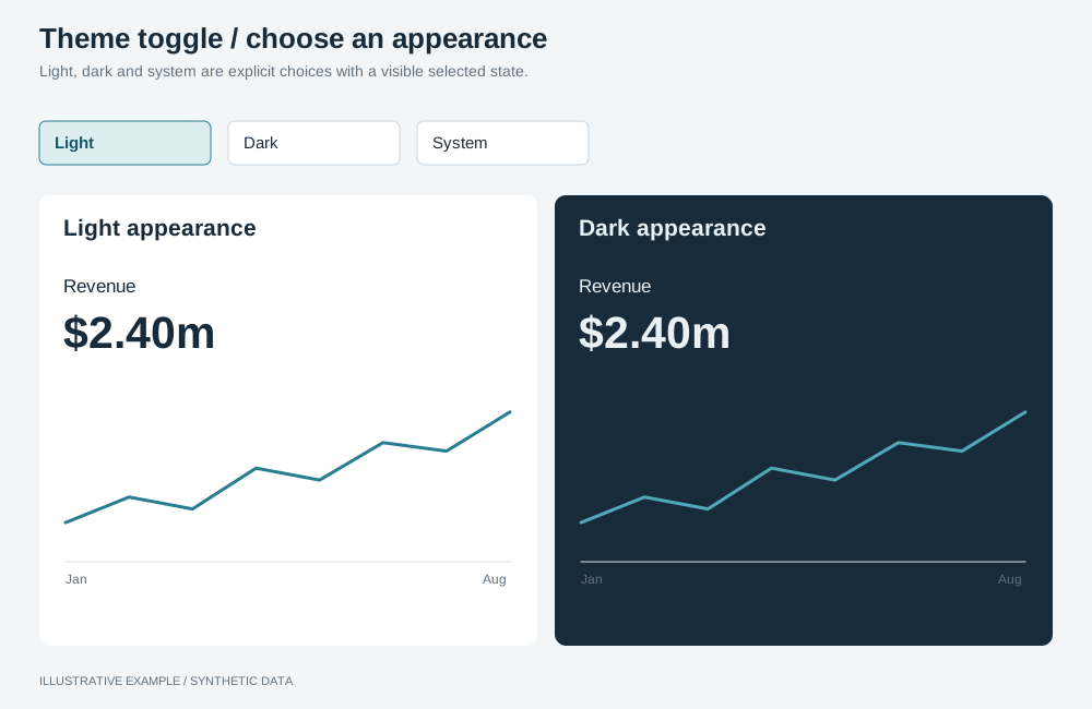
Illustrative example with synthetic data. Light, dark and system are explicit choices with a visible selected state.
When to use a theme toggle
Section titled “When to use a theme toggle”Use one when the page has a dark theme.
- Should the page be able to follow the operating system again after the reader picks a theme? Use the three-way choice: light, dark and system.
- Otherwise, use the toggle button.
| Variant | Contents | Common use cases | Choose another variant when |
|---|---|---|---|
| Toggle button | One button, pressed when dark | An overview with few header controls | Readers expect the page to follow a system theme that changes by time of day |
| Three-way choice | Three radios: light, dark, system | A page kept open all day, or opened on shared machines | The header has no room; put the choice in a settings menu |
Markup
Section titled “Markup”Set the theme before the first paint with an inline classic script in <head>, before the
stylesheets. A module script runs after the first paint, so the page would flash in the light
theme. If your host’s policy blocks inline scripts, load the same lines as a separate classic
script without defer or async.
<head> <script> (() => { let choice = null; try { choice = localStorage.getItem('theme'); } catch {} const dark = choice === 'dark' || (choice !== 'light' && matchMedia('(prefers-color-scheme: dark)').matches); document.documentElement.dataset.theme = dark ? 'dark' : 'light'; })(); </script></head>Toggle button:
<button class="theme-toggle" type="button" aria-pressed="false"> <svg class="icon-moon" aria-hidden="true"><!-- moon --></svg> <svg class="icon-sun" aria-hidden="true"><!-- sun --></svg> <span class="control__label">Dark theme</span></button>Three-way choice:
<fieldset class="theme-choice"> <legend class="visually-hidden">Theme</legend> <label> <input type="radio" name="theme" value="light" /> <svg aria-hidden="true"><!-- sun --></svg> <span class="visually-hidden">Light</span> </label> <label> <input type="radio" name="theme" value="dark" /> <svg aria-hidden="true"><!-- moon --></svg> <span class="visually-hidden">Dark</span> </label> <label> <input type="radio" name="theme" value="system" /> <svg aria-hidden="true"><!-- monitor --></svg> <span class="visually-hidden">System</span> </label></fieldset>- The button’s label stays “Dark theme”;
aria-pressedcarries the state. .control__labeland.visually-hiddenare the header’s hiding rules.
:root {  /* Native controls, scrollbars and form fields follow the theme. */  color-scheme: light;}:root[data-theme='dark'] {  color-scheme: dark;}
/* The icon shows the theme a press switches to. */.theme-toggle .icon-sun {  display: none;}.theme-toggle[aria-pressed='true'] .icon-sun {  display: block;}.theme-toggle[aria-pressed='true'] .icon-moon {  display: none;}
/* 1 + 3 × 34 + 2 × 1 + 1 = 106px wide, 36px tall. */.theme-choice {  display: flex;  box-sizing: border-box;  height: var(--header-control);  min-inline-size: 0;  margin: 0;  padding: 0;  border: 1px solid var(--line);  border-radius: var(--radius);  overflow: hidden;}.theme-choice > label {  position: relative;  display: grid;  place-items: center;  width: calc(var(--header-control) - 2px);  cursor: pointer;}.theme-choice > label + label {  border-inline-start: 1px solid var(--line);}/* The transparent radio covers its label, so it keeps focus, arrow keys and clicks. */.theme-choice input {  position: absolute;  inset: 0;  margin: 0;  opacity: 0;  cursor: inherit;}.theme-choice > label:has(:checked) {  background: color-mix(in srgb, var(--ink) 10%, transparent);}.theme-choice > label:has(:focus-visible) {  outline: 2px solid var(--ink);  outline-offset: -3px;}
When the header keeps dark chrome in both themes, use the chrome tokens; see Keep the chrome consistent across themes.
Behaviour
Section titled “Behaviour”type Choice = 'light' | 'dark' | 'system';type Theme = 'light' | 'dark';
// From /app-theming/#define-colour-tokens.declare function applyTheme(choice: Choice): Theme;// Re-applies every colour operation; see /app-theming/#switch-themes-in-place.declare function restyleObjects(theme: Theme): Promise<void>;
const KEY = 'theme';const media = matchMedia('(prefers-color-scheme: dark)');const toggle = document.querySelector<HTMLButtonElement>('.theme-toggle');const radios = [...document.querySelectorAll<HTMLInputElement>('.theme-choice input')];
const readChoice = (): Choice => { try { const stored = localStorage.getItem(KEY); return stored === 'light' || stored === 'dark' ? stored : 'system'; } catch { return 'system'; }};const saveChoice = (choice: Choice) => { try { if (choice === 'system') localStorage.removeItem(KEY); else localStorage.setItem(KEY, choice); } catch { // Storage is blocked: the choice lasts until the page closes. }};
let choice = readChoice();// Restyles run in order, so a quick second switch cannot finish before the first.let restyles = Promise.resolve();
const apply = () => { const before = document.documentElement.dataset.theme; const theme = applyTheme(choice); if (theme !== before) { restyles = restyles .then(() => restyleObjects(theme)) .catch((error: unknown) => console.error('Restyle failed', theme, error)); } toggle?.setAttribute('aria-pressed', String(theme === 'dark')); for (const radio of radios) radio.checked = radio.value === choice;};
const choose = (next: Choice) => { choice = next; saveChoice(next); apply();};
toggle?.addEventListener('click', () => { choose(document.documentElement.dataset.theme === 'dark' ? 'light' : 'dark');});for (const radio of radios) { radio.addEventListener('change', () => { if (radio.value === 'light' || radio.value === 'dark' || radio.value === 'system') choose(radio.value); });}media.addEventListener('change', () => { if (choice === 'system') apply();});
apply();- Keep the storage key and values the same in the pre-paint script and the bundle. Choosing
systemremoves the key. - The pre-paint script has already set the theme, so the first
apply()restyles nothing. Build each object’s operations for the current theme when you mount it. - The toggle button stores an explicit theme on its first press, so the page stops following the system; the three-way choice can return to it.
- Anything painted from CSS tokens, including SVG with
fill: var(--…), followsdata-themewithout code. Redraw canvas you paint yourself. - A theme switch costs no query.
Responsive behaviour
Section titled “Responsive behaviour”| Width | Toggle button | Three-way choice |
|---|---|---|
| Wide header | Icon and label | Three icons, 106px |
| Narrow header | Icon only; the label stays as the accessible name | Unchanged |
The header’s fold width is set in Header.