

Quick filters
Quick filters are a row of buttons, each selecting one value of one field: one button per year, per region or per channel, or a dot per month. They suit a field with a few values that readers switch often. The row sits in the header, the filter bar or a card’s title row. The buttons write selections from your own UI; the rules are in Driving selections from your own UI, and the group and apply bar in Filters and selections.
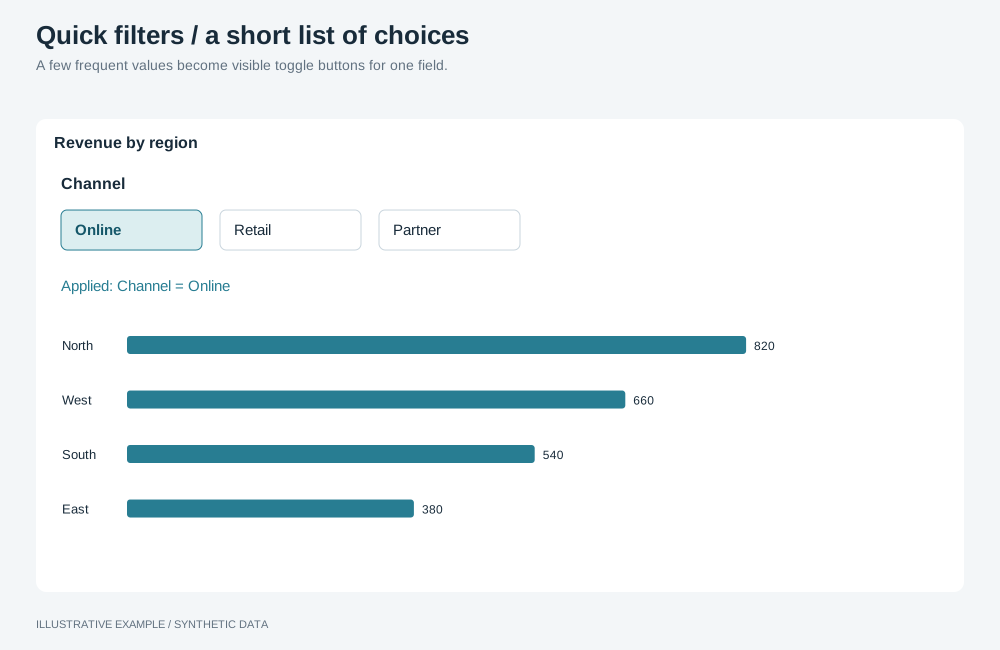
Illustrative example with synthetic data. A few frequent values become visible toggle buttons for one field.
Choose quick filters or another component
Section titled “Choose quick filters or another component”Use quick filters when every value fits on one row at the narrowest width you support: up to about seven short labels, or twelve dots.
| The field has | Use |
|---|---|
| More values than fit on one row, or values that change often | A filter object in the filter bar or filter panel |
| Values that should narrow as other filters change, with search or a measure beside each value | A filter object in listbox mode |
| A period or date range | Period picker |
| Measures rather than values | Metric switcher |
The filter object has no button or pill mode; see App limitations.
Choose a variant
Section titled “Choose a variant”- Does the field take exactly one value, or all, at a time? Use a radio group.
- Otherwise, use toggle buttons, which select any number of values.
Label options with text for short values, an icon with a hidden text label for well-known icons, or a dot with a hidden text label when order is the information.
| Variant | Selects | Use cases | Choose another when |
|---|---|---|---|
| Toggle buttons | Any number; none means all | Regions; channels as icons; priorities P1–P4 | Only one value makes sense at a time |
| Radio group | One value, or All | Years; months as dots; open, closed, all | Readers compare several values at once |
Markup
Section titled “Markup”<!-- Toggle buttons --><div class="quick-filter" role="group" aria-labelledby="qf-region-label"> <span class="quick-filter__label" id="qf-region-label">Region</span> <div class="quick-filter__options"> <button class="quick-filter__option" type="button" aria-pressed="false">North</button> <button class="quick-filter__option" type="button" aria-pressed="false"> <svg aria-hidden="true" width="16" height="16"></svg><span class="visually-hidden">Store</span> </button> </div></div>
<!-- Radio group --><fieldset class="quick-filter"> <legend class="quick-filter__label">Year</legend> <div class="quick-filter__options"> <label class="quick-filter__option"><input type="radio" name="qf-year" value="" checked /> All</label> <label class="quick-filter__option"><input type="radio" name="qf-year" value="2025" /> 2025</label> </div></fieldset>Keep each option’s name the value alone; aria-pressed or the radio announces its state. Native
radios provide the arrow-key behaviour.
The component reads --line, --surface, --ink, --muted and --radius from the style. The
selected option inverts --ink and --surface, so the state does not depend on hue.
:root {  --qf-h: 32px;}
.quick-filter {  display: flex;  align-items: center;  gap: 8px;  min-width: 0;  margin: 0;  padding: 0;  border: 0;}/* A <legend> is not a flex item; float takes it into the row. */.quick-filter > legend {  float: left;  padding: 0;}.quick-filter__label {  flex: none;  color: var(--muted);}.quick-filter__options {  display: flex;  gap: 4px;  min-width: 0;  overflow-x: auto;  /* Room for the 2px focus ring at a 2px offset, which overflow would clip. */  padding: 4px;}.quick-filter__option {  flex: none;  display: inline-flex;  align-items: center;  gap: 6px;  box-sizing: border-box;  height: var(--qf-h);  padding: 0 12px;  border: 1px solid var(--line);  border-radius: var(--radius);  background: var(--surface);  color: var(--ink);  font: inherit;  cursor: pointer;}.quick-filter__option:is([aria-pressed='true'], :has(input:checked)) {  background: var(--ink);  border-color: var(--ink);  color: var(--surface);}/* Pending until Apply; set by script. */.quick-filter__option[data-pending] {  border-style: dashed;}
/* The radio stays focusable. */.quick-filter__option input {  position: absolute;  opacity: 0;  width: 1px;  height: 1px;  margin: 0;}.quick-filter__option:has(input:focus-visible) {  outline: 2px solid var(--ink);  outline-offset: 2px;}
/* Dots: a 10px mark in a 24px target. 12 × 24 + 11 × 2 + 2 × 4 = 318. */.quick-filter--dots .quick-filter__options {  gap: 2px;}.quick-filter--dots .quick-filter__option {  width: 24px;  height: 24px;  padding: 0;  justify-content: center;  border: 0;  background: none;}.quick-filter--dots .quick-filter__option::before {  content: '';  width: 10px;  height: 10px;  border: 1px solid var(--ink);  border-radius: 50%;}.quick-filter--dots .quick-filter__option:has(input:checked) {  background: none;}.quick-filter--dots .quick-filter__option:has(input:checked)::before {  background: var(--ink);}
.visually-hidden {  position: absolute;  width: 1px;  height: 1px;  overflow: hidden;  clip-path: inset(50%);  white-space: nowrap;}
In the header, set --qf-h to --header-control.
Load the values from the model
Section titled “Load the values from the model”Query the field’s values rather than typing a list into the page, so the row follows the data. Look the field up first; see Look every field up by name.
import type { AstratoAppRuntime } from '@astrato-io/app-runtime';
declare const app: AstratoAppRuntime; // from createAstratoApp()
type Value = string | number | boolean | null;
const GROUP = 'dashboard';const selections = app.client.services.selections;declare const FIELD: string; // looked up by nameconst MAX_VALUES = 12;
const loadValues = async (): Promise<Value[]> => { const result: unknown = await app.client.services.engine.getData({ semanticLayerId: app.dataBinding.semanticLayerId, query: { dimensions: [{ fieldKey: FIELD, name: 'Region' }], orders: [{ columnIdx: 0, direction: 'asc' }], // One more than the row holds, to detect a field with too many values. limit: MAX_VALUES + 1, }, }); const data = (result as { response?: { data?: Record<string, unknown> } }).response?.data; if (!data) throw new Error(`No rows for ${FIELD}.`); const values = Object.values(data).map((row) => (Array.isArray(row) ? row[0] : undefined)); if (values.length > MAX_VALUES) throw new Error(`${FIELD} has more than ${MAX_VALUES} values.`); return values.filter( (value): value is Value => value === null || ['string', 'number', 'boolean'].includes(typeof value), );};- Keep each value in the type the query returned, and map buttons to values by index rather than
through a
data-attribute, which is always a string. - Query the values once, so buttons do not move as other filters change.
Write the selection
Section titled “Write the selection”selectValues replaces the field’s selection, so build the complete list and write it once.
declare const options: HTMLElement; // the group's .quick-filter__optionsdeclare const radios: HTMLInputElement[]; // for a radio group
// The app calls this once during startup.async function startQuickFilter(): Promise<void> {  const values = await loadValues();
  const buttons = values.map((value) => {    const button = document.createElement('button');    button.type = 'button';    button.className = 'quick-filter__option';    button.setAttribute('aria-pressed', 'false');    button.textContent = value === null ? 'No value' : String(value);    return button;  });  options.replaceChildren(...buttons);
  const write = (selected: Value[]) => {    if (selected.length === 0) {      // Drops the field's pending and applied selections. Removal is not pending: it applies at once.      selections.declineSelection(GROUP, { fieldKey: FIELD });      selections.removeSelection(GROUP, { fieldKey: FIELD });      return;    }    selections.selectValues(GROUP, { field: { fieldKey: FIELD }, operator: 'inList', values: selected });  };
  // Toggle buttons.  for (const button of buttons) {    button.addEventListener('click', () => {      const pressed = button.getAttribute('aria-pressed') !== 'true';      write(        values.filter((_, i) =>          buttons[i] === button ? pressed : buttons[i]?.getAttribute('aria-pressed') === 'true',        ),      );    });  }
  // Radio group: radios[0] is All; radios[i + 1] is values[i].  for (const [index, radio] of radios.entries()) {    radio.addEventListener('change', () => {      const value = index === 0 ? undefined : values[index - 1];      write(value === undefined ? [] : [value]);    });  }
  showCurrentState(values, buttons, radios);}
In manual mode, a write waits for the apply bar.
applyPendingSelections(GROUP) applies every pending selection in the group, not only this field’s.
Show the current state
Section titled “Show the current state”Draw the buttons and radios from the selection state, not from the click, so a selection written by a chart, a filter object or Clear all shows too. Read field keys as in Read selections defensively.
declare const selectionFieldKey: (selection: {  field?: { fieldKey?: string };  fieldKey?: string;}) => string | undefined;
function showCurrentState(values: Value[], buttons: HTMLButtonElement[], radios: HTMLInputElement[]): void {  selections.onActiveSelectionChange(GROUP).subscribe(({ applied, pending }) => {    const own = (list: typeof applied) => list.find((s) => selectionFieldKey(s) === FIELD);    const pendingOwn = own(pending);    const current = pendingOwn ?? own(applied);    const selected = current?.values ?? [];    for (const [i, button] of buttons.entries()) {      const value = values[i];      const on = value !== undefined && selected.includes(value);      button.setAttribute('aria-pressed', String(on));      button.toggleAttribute('data-pending', pendingOwn !== undefined);    }    // radios[0] is All. A selection of several values matches no single radio.    for (const [index, radio] of radios.entries()) {      radio.checked = index === 0 ? selected.length === 0 : selected.length === 1 && selected[0] === values[index - 1];    }  });}
The observable replays the current state on subscribe, so the row starts in step with any selection already in the group. A radio group checks the matching radio, or All when the field has no selection.
When the row runs out of width
Section titled “When the row runs out of width”Measure the row’s container, not the window. Either let the row scroll sideways or move the field to the filter panel as a filter object. Prefer the panel for toggle buttons, because a scrolled row hides which values are on. Measure the needed width once, while the row is shown, as in Fold the row into the filter panel; a hidden row measures 0.