

Dialog
A dialog blocks the page until it is closed: a data table, a confirmation, a filter drawer. Use the
native <dialog> element opened with showModal(), which makes the rest of the page inert, manages
focus and closes on Escape.
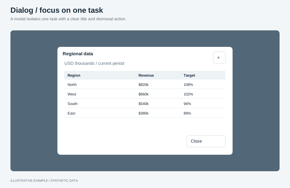
Illustrative example with synthetic data. A modal isolates one task with a clear title and dismissal action.
When to use a dialog
Section titled “When to use a dialog”Use one when the reader must finish or dismiss one task before going on.
| The page needs | Use |
|---|---|
| Views readers move between | Tabs |
| One item’s details with its own address | Drill-through |
| A short menu at the pointer | Object menu |
| A value on hover | A tooltip or hover card |
Choose a size
Section titled “Choose a size”- Does it slide in from the edge and hold filters or navigation? Use a drawer.
- Does it hold an object, such as a data table? Use large.
- Does it hold a form or several paragraphs? Use medium.
- Otherwise, use small.
| Size | Width | Common use cases |
|---|---|---|
| Small | 400px | Confirm clearing all filters |
| Medium | 640px | Settings. A chart’s definitions and notes |
| Large | 1100px, fixed height | Show an object’s data |
| Drawer | 320px, full height | Filter panel, side rail at narrow widths |
Markup
Section titled “Markup”<button type="button" id="show-data" aria-haspopup="dialog" aria-controls="data-dialog">Show as table</button>
<dialog class="dialog dialog--l" id="data-dialog" aria-labelledby="data-dialog-title"> <div class="dialog__head"> <h2 id="data-dialog-title">Revenue by region</h2> <form method="dialog"> <button type="submit" aria-label="Close"> <svg aria-hidden="true"><!-- close icon --></svg> </button> </form> </div> <div class="dialog__body"> <div class="dialog__object" data-object-id="revenue-table"></div> </div> <div class="dialog__actions"> <button type="button">Export data as CSV</button> <button type="button">Export data as Excel</button> </div></dialog>- A button in
<form method="dialog">closes the dialog and setsreturnValueto itsvalue. For a confirmation, put both answers in the form and readreturnValuein thecloseevent. - Put
autofocuson the safe answer of a confirmation, usually Cancel.
.dialog {  box-sizing: border-box;  width: min(var(--dialog-w), 100% - 2 * var(--gap));  max-width: none;  max-height: calc(100% - 2 * var(--gap));  padding: 0;  border: 1px solid var(--line);  border-radius: var(--radius);  background: var(--surface);  color: var(--ink);}/* Display only on the open dialog; see /app-layout/#css-rules-that-fail-silently. */.dialog[open] {  display: grid;  grid-template-rows: auto minmax(0, 1fr) auto;}.dialog::backdrop {  background: rgb(0 0 0 / 40%);}.dialog__head,.dialog__actions {  display: flex;  align-items: center;  gap: 8px;  padding: var(--gap);}.dialog__head {  justify-content: space-between;}.dialog__head h2 {  min-width: 0;  margin: 0;  overflow: hidden;  text-overflow: ellipsis;  white-space: nowrap;}.dialog__actions {  justify-content: flex-end;}.dialog__body {  min-height: 0;  overflow: auto;  padding: 0 var(--gap);}
.dialog--s {  --dialog-w: 400px;}.dialog--m {  --dialog-w: 640px;}.dialog--l {  --dialog-w: 1100px;  /* A fixed height, so an object inside has a definite box before it mounts. */  height: calc(100% - 2 * var(--gap));}.dialog--l .dialog__body {  display: grid;}.dialog--l .dialog__object {  min-height: 0;}
/* Medium and large fill the window on a phone. */@media (width < 600px) {  .dialog--m,  .dialog--l {    width: 100%;    height: 100%;    max-height: none;    margin: 0;    border: 0;    border-radius: 0;  }}
Drawer
Section titled “Drawer”.dialog--drawer { --dialog-w: 320px; height: 100%; max-height: none; margin: 0 0 0 auto; border-width: 0 0 0 1px; border-radius: 0;}For a drawer on the left, set margin: 0 and put the border on the right.
Behaviour
Section titled “Behaviour”showModal()moves focus into the dialog; Tab stays inside it; Escape firescanceland closes it;closefires for every way it closes, and focus returns to the opener.- A click on the backdrop does not close the dialog; see
Build it as a
<dialog>. - If the opener is removed while the dialog is open, focus its replacement in the
closehandler.
Mount objects only while open
Section titled “Mount objects only while open”An object mounted in a closed dialog keeps querying; see
Hidden means unmounted. Mount after showModal(), so the host
has a box, and unmount on close:
// Panel is the lifecycle class from /app-objects/#hidden-means-unmounted.declare const tablePanel: { show(host: HTMLElement): void; hide(): void };
const opener = document.querySelector<HTMLButtonElement>('#show-data');const dialog = document.querySelector<HTMLDialogElement>('#data-dialog');const host = dialog?.querySelector<HTMLElement>('.dialog__object');if (!opener || !dialog || !host) throw new Error('Dialog markup not found.');
opener.addEventListener('click', () => {  dialog.showModal();  tablePanel.show(host);});dialog.addEventListener('close', () => tablePanel.hide());
Opening costs one query per object in the dialog. Objects in a dialog join the page’s selection group.
Responsive behaviour
Section titled “Responsive behaviour”| Width | Small | Medium and large | Drawer |
|---|---|---|---|
| 600px and wider | 400px, centred | 640px or 1100px, capped at the window less the gaps | 320px, full height |
| Under 600px | Window less the gaps | Fills the window | Full height, capped at the window less the gaps |