

Side rail
A side rail is a column on the left edge that holds the app’s navigation and, in the labelled variant, its filters and export. The header and board sit to its right, so the rail’s width adds to the layout’s width breakpoints.
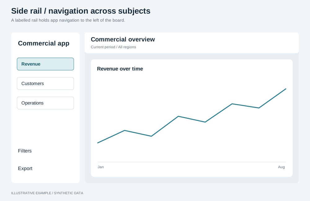
Illustrative example with synthetic data. A labelled rail holds app navigation to the left of the board.
When to use a side rail
Section titled “When to use a side rail”Use one when the app has three or more pages, or when the filters do not fit in the header.
| The page needs | Use |
|---|---|
| Two to four views of one subject | Tabs |
| A few filters beside the title | Header with a filter bar |
| Many filters, opened on demand | Filter panel |
| A landing page that links to the other pages | Hub layout |
Choose a variant
Section titled “Choose a variant”- Does the rail hold filter objects, or do page names need to be read to be told apart? Use labelled.
- Otherwise, use icon-only.
| Variant | Width | Common use cases | Choose another variant when |
|---|---|---|---|
| Icon-only | 64px | An operations app with four or five pages, each with a distinct icon | Icons alone do not tell the pages apart; the filters belong in the rail |
| Labelled | 200–240px | A reporting app with named sections and shared filters | The rail makes the board drop a tier; use icon-only and a filter panel |
From top to bottom: brand, navigation links with aria-current="page" on the current page, filters
(labelled only), and, at the bottom, export and the data source.
Markup
Section titled “Markup”<div class="app"> <aside class="rail rail--icons" aria-label="App"> <a class="rail__brand" href="#/"> <svg aria-hidden="true"><!-- logo --></svg> <span class="rail__label">Operations</span> </a> <nav class="rail__nav" aria-label="Pages"> <ul> <li> <a class="rail__link" href="#/shipments" aria-current="page"> <svg aria-hidden="true"><!-- icon --></svg> <span class="rail__label">Shipments</span> </a> </li> </ul> </nav> <div class="rail__foot"> <button class="rail__link" type="button"> <svg aria-hidden="true"><!-- icon --></svg> <span class="rail__label">Export</span> </button> <p class="rail__credits">Source: Warehouse</p> </div> </aside> <div class="main"> <header class="header"> <button class="menu-trigger" type="button" aria-label="Menu" aria-haspopup="dialog" aria-controls="rail-drawer"> <svg aria-hidden="true"><!-- menu icon --></svg> </button> <!-- title and controls --> </header> <main class="board"><!-- the layout --></main> </div></div>
<dialog class="dialog dialog--drawer rail-drawer" id="rail-drawer" aria-labelledby="rail-drawer-title"> <div class="dialog__head"> <h2 id="rail-drawer-title">Menu</h2> <form method="dialog"><button type="submit" aria-label="Close">×</button></form> </div> <div class="dialog__body"><!-- navigation, filters and export, labelled --></div></dialog>- Use links, so each page has an address.
- In the icon-only variant,
.rail__labelis the accessible name and is shown as a tooltip. Do not add a separatearia-label.
:root {  --rail-w: 64px;}
.app {  display: grid;  grid-template-columns: var(--rail-w) minmax(0, 1fr);  min-height: 100svh;}.main {  min-width: 0;}.rail {  position: sticky;  top: 0;  /* Above the board, so icon-only tooltips are not painted under it. */  z-index: 2;  display: flex;  flex-direction: column;  gap: var(--gap);  box-sizing: border-box;  height: 100svh;  padding: var(--gap) 8px;  background: var(--surface);  border-inline-end: 1px solid var(--line);}.rail__nav ul {  display: grid;  gap: 4px;  margin: 0;  padding: 0;  list-style: none;}.rail__brand,.rail__link {  display: flex;  align-items: center;  gap: 12px;  box-sizing: border-box;  width: 100%;  height: 40px;  padding: 0 12px;  border: 0;  border-radius: var(--radius);  background: none;  color: inherit;  font: inherit;  text-decoration: none;}.rail__link[aria-current='page'] {  background: var(--line);}.rail__brand svg,.rail__link svg {  flex: none;  width: 20px;  height: 20px;}.rail__foot {  display: grid;  gap: 4px;  margin-top: auto;}.rail__credits {  margin: 0;  padding: 0 12px;  color: var(--muted);  font-size: 12px;}.menu-trigger {  display: none;}
Icon-only
Section titled “Icon-only”.rail--icons .rail__brand,.rail--icons .rail__link { position: relative; justify-content: center; padding: 0;}.rail--icons .rail__label { position: absolute; top: 50%; left: calc(100% + 8px); translate: 0 -50%; padding: 4px 8px; border-radius: var(--radius); background: var(--ink); color: var(--surface); white-space: nowrap; /* opacity keeps the label in the accessibility tree; display: none would remove the name. */ opacity: 0; pointer-events: none;}.rail--icons :is(.rail__brand, .rail__link):is(:hover, :focus-visible) .rail__label { opacity: 1;}.rail--icons .rail__credits { display: none;}Do not set overflow on an icon-only rail; it clips the tooltips.
Labelled
Section titled “Labelled”/* .app's column template reads --rail-w, so set the width on .app. */.app:has(.rail--labelled) { --rail-w: 224px;}.rail--labelled { overflow-y: auto;}.rail--labelled .rail__label { overflow: hidden; text-overflow: ellipsis; white-space: nowrap;}Narrow widths
Section titled “Narrow widths”Below 700px, a menu button in the header replaces the rail and opens a left-edge drawer. The header keeps its height, so height thresholds do not change.
@media (width < 700px) { .app { grid-template-columns: minmax(0, 1fr); } .rail { display: none; } .menu-trigger { display: inline-flex; }}.rail-drawer { margin: 0; border-width: 0 1px 0 0;}Add the rail to a layout’s thresholds
Section titled “Add the rail to a layout’s thresholds”Add --rail-w to every width breakpoint at or above the fold (700px here); below the fold the
rail is hidden. Media queries cannot read custom properties, so write the sums as numbers:
/* A 1280px layout breakpoint with a 64px rail: 1280 + 64 = 1344 */@media (width < 1344px) { /* the layout's rules for this tier */}- Fold the rail at one of the layout’s own breakpoints, so a tier is not split in two.
- Height thresholds do not change.
- If the rail changes variant by width, use the width in force at each breakpoint.
See Calculate a width breakpoint.
Behaviour
Section titled “Behaviour”-
Drawer. Open it with
showModal()from the menu button; see Dialog. -
Filters in the rail. A filter object in a hidden rail keeps querying. Unmount the rail’s filters when it folds and mount the drawer’s copies only while the drawer is open; see Hidden means unmounted. Both copies write to the same selection group.
// Panel is the lifecycle class from /app-objects/#hidden-means-unmounted.declare const railFilters: { panel: { show(host: HTMLElement): void; hide(): void }; host: HTMLElement }[];const narrow = matchMedia('(width < 700px)');const syncRailFilters = () => {for (const { panel, host } of railFilters) {if (narrow.matches) panel.hide();else panel.show(host);}};narrow.addEventListener('change', syncRailFilters);syncRailFilters(); -
Page changes. Selections are held in memory, so loading another HTML document starts with none. Switch pages by hash inside one document to keep them; see Limitations to design around.
Responsive behaviour
Section titled “Responsive behaviour”| Width | Icon-only | Labelled |
|---|---|---|
| 700px and wider | 64px rail; labels as tooltips | 224px rail |
| Under 700px | Menu button and drawer | Menu button and drawer with filters |