

Filter bar
A filter bar is a row of mounted filter objects under the header, with
the apply bar below it. It sticks with the header. When the row runs out of width, its filters move
into a filter panel and the apply bar stays. Selections and the
apply bar itself are covered in Filters and selections. Keep the apply bar row even
when selections apply automatically: it is the page’s
selection bar.
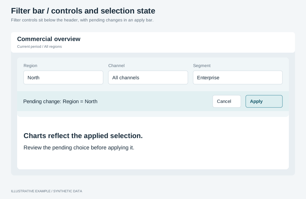
Illustrative example with synthetic data. Filter controls sit below the header, with pending changes in an apply bar.
Choose a filter bar or a panel
Section titled “Choose a filter bar or a panel”- Are there more filters than fit across the narrowest width you support, or do readers filter rarely? Use a filter panel only, with the apply bar under the header.
- Otherwise, use a filter bar that folds into the panel.
| Use | Use cases | Choose another when |
|---|---|---|
| Filter bar | Three to six filters adjusted while reading: region, channel, team, priority | Filters are set once per visit, there are many, or they need a tall list |
| Filter panel | Many filters, or filters set rarely | Readers need to see every filter’s value while they read |
Markup
Section titled “Markup”<div class="app-top"> <header class="app-header">…</header> <div class="filter-bar"> <div class="filter-bar__row" role="group" aria-label="Filters"> <div class="filter-host" data-object-id="region-filter@bar"></div> <div class="filter-host" data-object-id="channel-filter@bar"></div> </div> <div class="apply-bar" role="region" aria-label="Selections"> <div class="apply-bar__chips"></div> <button type="button" class="apply-bar__clear">Clear all</button> <span class="apply-bar__pending" hidden> <button type="button">Discard</button> <button type="button">Apply</button> </span> </div> </div></div>Each instance id names its placement (@bar), because the filter panel mounts its own instance of
the same filter.
The bar uses the shared tokens in Tokens and thresholds.
:root {  --filter-h: 72px;  --apply-h: 40px;}
/* On the element that contains the header and the board. */.app {  /* 16 + 72 + 40 = 128 */  --filter-bar-h: calc(var(--gap) + var(--filter-h) + var(--apply-h));  --above-board: var(--filter-bar-h);}.app[data-filters='folded'],.app[data-filters='docked'] {  /* 16 + 40 = 56 */  --filter-bar-h: calc(var(--gap) + var(--apply-h));}
.filter-bar {  display: grid;  grid-template-rows: var(--filter-h) var(--apply-h);  box-sizing: border-box;  height: var(--filter-bar-h);  padding: var(--gap) var(--gap) 0;}.filter-bar__row {  --filter-min: 160px;  display: grid;  grid-auto-flow: column;  grid-auto-columns: minmax(var(--filter-min), 240px);  gap: var(--gap);  min-width: 0;  overflow: hidden;}/* Size the host, not the filter. */.filter-host {  height: var(--filter-h);  min-width: 0;}.apply-bar {  display: flex;  align-items: center;  gap: 8px;  min-width: 0;}.apply-bar__chips {  display: flex;  flex: 1 1 auto;  gap: 8px;  min-width: 0;  overflow-x: auto;}.apply-bar__chips > * {  flex: none;}
.app[data-filters='folded'] .filter-bar,.app[data-filters='docked'] .filter-bar { grid-template-rows: var(--apply-h);}.app[data-filters='folded'] .filter-bar__row,.app[data-filters='docked'] .filter-bar__row { display: none;}.app:not([data-filters='folded'], [data-filters='docked']) .filters-trigger { display: none;}--above-boardreads--filter-bar-h, so the board and the bar follow one value. With more than one band above the board, set--above-boardonce as their sum; see Bands above the board.- Add the bar to the layout’s scrolling threshold, for example 728 + 128 = 856.
- Show applied filters only while something is applied, and put them in a row that is already there, such as the end of the filter row or the header, so showing them moves nothing. A separate apply bar keeps its height when empty, so applying or clearing does not move the board.
Configure the filter objects
Section titled “Configure the filter objects”- Use the page’s one selection group; see Use one selection group.
- Turn responsive sizing off (
presentation.responsive: false, orsetFilterResponsive) and size the host; see Header and controls. - Use
dropdownmode (setFilterMode) in the bar. - Turn quick select off (
presentation.quickSelect: false, orsetFilterQuickSelect). With it on, a choice is applied immediately and skips the apply bar.
See the filter operations.
Fold the row into the filter panel
Section titled “Fold the row into the filter panel”Fold when the row’s minimum width exceeds the header’s content width. Measure the header, not the viewport. Unmount the bar’s filters when they fold; see Hidden means unmounted.
// Panel is the lifecycle class from Hidden means unmounted; one per bar instance.declare const barFilters: { panel: Panel; host: HTMLElement }[];
const app = document.querySelector<HTMLElement>('.app');const header = document.querySelector<HTMLElement>('.app-header');const row = document.querySelector<HTMLElement>('.filter-bar__row');if (!app || !header || !row) throw new Error('Header or filter bar is missing.');
// Every host at its minimum width, plus the gaps between them.function neededWidth(row: HTMLElement): number {  const style = getComputedStyle(row);  const min = parseFloat(style.getPropertyValue('--filter-min'));  const gap = parseFloat(style.columnGap);  const count = row.children.length;  return count * min + (count - 1) * gap;}
new ResizeObserver((entries) => { const entry = entries[0]; if (!entry || app.dataset.filters === 'docked') return; const state = neededWidth(row) > entry.contentRect.width ? 'folded' : 'inline'; if (app.dataset.filters === state) return; app.dataset.filters = state; for (const { panel, host } of barFilters) { if (state === 'inline') panel.show(host); else panel.hide(); }}).observe(header);- A
ResizeObserverreports once when observation starts, so this also makes the first mount. Do not mount the bar’s filters anywhere else. contentRectexcludes the header’s padding, which equals the bar’s.- Pending selections belong to the group, so folding keeps them in the apply bar.
For example, five filters need 5 × 160 + 4 × 16 = 864px of row, so the bar folds below a 896px-wide header.
Related
Section titled “Related”- Build an apply bar
- Filter panel: where folded filters go