

Item header
The item header sits between the app header and the board of a detail page. It names the item the page is filtered to and holds the controls that move to another item or back to the overview. Its height is fixed.
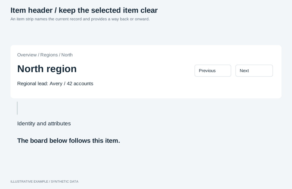
Illustrative example with synthetic data. An item strip names the current record and provides a way back or onward.
When to use an item header
Section titled “When to use an item header”Use one on every page that shows one item reached from another page.
| The page needs | Use |
|---|---|
| A title for a page that is not about one item | Header |
| A label per item in a side-by-side comparison | The compare page |
| An item picked from a list on the same page | The master–detail layout |
Choose a variant
Section titled “Choose a variant”- Did the reader reach the item through more than one level, such as region then store? Show a breadcrumb on the first line.
- Otherwise, leave it out; the Back link names the page it returns to.
| Variant | Lines on the left | Common use cases |
|---|---|---|
| Without breadcrumb | Name, attributes | A customer opened from a table |
| With breadcrumb | Path, name, attributes | A store opened from a region |
- Left: optional breadcrumb; the name, as the page’s
h1; two to four identifying attributes, most identifying first. - Right: position (
3 of 48), Previous, Next, and a Back link named after the overview.
Markup
Section titled “Markup”<header class="item-header" aria-labelledby="item-name"> <div class="item-header__id"> <!-- optional: <nav class="breadcrumb" aria-label="Breadcrumb">…</nav> --> <h1 class="item-header__name" id="item-name" title="Store 12 – Central">Store 12 – Central</h1> <dl class="item-header__attrs"> <div> <dt>Region</dt> <dd>North</dd> </div> <div> <dt>Code</dt> <dd>S-012</dd> </div> </dl> </div> <div class="item-header__nav"> <p class="item-header__pos" role="status"><span class="visually-hidden">Store 12 – Central, </span>3 of 48</p> <button class="item-header__step" type="button" aria-label="Previous store"> <svg aria-hidden="true"><!-- chevron left --></svg> </button> <button class="item-header__step" type="button" aria-label="Next store"> <svg aria-hidden="true"><!-- chevron right --></svg> </button> <a class="item-header__back" href="#/">Back to stores</a> </div></header>- Keep the app title in the header as text, not a second
h1. titleshows the full name when it is truncated.- The position is a status region, so moving to another item announces it.
:root {  /* On :root, so --above-board on the page element can read it. */  --item-header-h: 72px;}
.item-header {  display: grid;  grid-template-columns: minmax(0, 1fr) auto;  align-items: center;  gap: var(--gap);  box-sizing: border-box;  height: var(--item-header-h);  overflow: hidden;}/* 16 + 28 + 16 = 60px of 72px. With larger type, raise --item-header-h and the thresholds. */.item-header__id {  display: grid;  min-width: 0;}.item-header__id > * {  min-width: 0;  margin: 0;  overflow: hidden;  text-overflow: ellipsis;  white-space: nowrap;}.item-header__id .breadcrumb {  font-size: 12px;  line-height: 16px;}.item-header__name {  font-size: 20px;  line-height: 28px;}.item-header__attrs {  display: flex;  gap: 12px;  min-width: 0;  font-size: 13px;  line-height: 16px;}.item-header__attrs div {  display: flex;  flex: 0 1 auto;  gap: 4px;  min-width: 0;}.item-header__attrs dd {  overflow: hidden;  white-space: nowrap;  text-overflow: ellipsis;}.item-header__attrs dt {  color: var(--muted);}.item-header__attrs dd {  margin: 0;}.item-header__nav {  display: flex;  align-items: center;  gap: 8px;}.item-header__pos {  margin: 0 8px 0 0;  color: var(--muted);  white-space: nowrap;}.item-header__step,.item-header__back {  display: inline-flex;  align-items: center;  justify-content: center;  box-sizing: border-box;  height: var(--header-control, 36px);  border: 1px solid var(--line);  border-radius: var(--radius);}.item-header__step {  width: var(--header-control, 36px);  padding: 0;  background: none;  color: inherit;}.item-header__step[aria-disabled='true'] {  opacity: 0.4;  cursor: default;}.item-header__back {  padding: 0 12px;  color: inherit;  text-decoration: none;  white-space: nowrap;}.visually-hidden {  position: absolute;  width: 1px;  height: 1px;  overflow: hidden;  clip-path: inset(50%);  white-space: nowrap;}/* Under 600px the position is read, not shown, so the name keeps the width. */@media (width < 600px) {  .item-header__pos {    position: absolute;    width: 1px;    height: 1px;    overflow: hidden;    clip-path: inset(50%);  }}
The item header adds var(--item-header-h) + var(--gap) to --above-board; see
Bands above the board.
Behaviour
Section titled “Behaviour”- Previous and next open the neighbouring item in the overview’s order; see
Drill-through. At the first and last item, set
aria-disabled="true"and ignore activation, so focus is not lost as it would be from adisabledbutton. - Back returns to the overview; see Drill-through.
- Name and attributes come from your own query, filtered to the item. Re-query on applied changes and ignore superseded results; see Re-query your own objects only on applied changes. Keep the height while it runs: show the name from the address first and fill in the attributes when they arrive.
Responsive behaviour
Section titled “Responsive behaviour”| Width | Left | Right |
|---|---|---|
| 600px and wider | Each line truncated to one line | Position, previous, next, back |
| Under 600px | Same | Previous, next, back; position for screen readers only |