

Period picker
A period picker sets the time range the page follows: month to date, quarter to date, year to date,
the last 12 months or a custom range, optionally with a comparison period. The period is an applied
selection on the date field, as Periods and date ranges
describes. Build it as a preset control behind a header button, or mount a date-picker object.
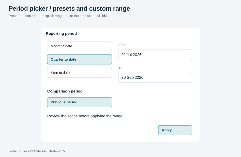
Illustrative example with synthetic data. Preset periods and an explicit range make the time scope visible.
Choose a control
Section titled “Choose a control”- Does the page show a comparison period, or name the period in the header? Use the preset control.
- Do readers pick arbitrary dates from a calendar more often than a preset? Use the date picker.
- Otherwise, use the preset control.
| Control | Where | Use cases | Choose another when |
|---|---|---|---|
| Preset control | A header button opening a popover | A monthly review against last year; switching between MTD, QTD and YTD | Readers pick dates from a calendar more than presets |
| Date picker | A host in the filter bar or filter panel | An operations log searched by date range | The page needs a comparison, or the period’s name in the header |
Use one per page: both select on the same date field, and a second selection on a field replaces the first.
Build a preset control
Section titled “Build a preset control”<button class="period-trigger" type="button" popovertarget="period-menu"> <svg aria-hidden="true"></svg><span class="control__label" id="period-label">Last 12 months</span></button>
<div class="period-menu" id="period-menu" popover aria-label="Period"> <fieldset> <legend>Period</legend> <label><input type="radio" name="period" value="mtd" /> Month to date</label> <label><input type="radio" name="period" value="qtd" /> Quarter to date</label> <label><input type="radio" name="period" value="ytd" /> Year to date</label> <label><input type="radio" name="period" value="l12m" checked /> Last 12 months</label> <label><input type="radio" name="period" value="custom" /> Custom range</label> </fieldset> <fieldset class="period-menu__custom" disabled> <legend>Custom range</legend> <label>From <input type="date" name="from" /></label> <label>To <input type="date" name="to" /></label> </fieldset> <fieldset> <legend>Compare with</legend> <label><input type="radio" name="compare" value="none" checked /> No comparison</label> <label><input type="radio" name="compare" value="previous" /> Previous period</label> <label><input type="radio" name="compare" value="lastYear" /> Same period last year</label> </fieldset></div>An auto popover closes on Escape and outside clicks. Omit Compare with when the page has no
comparison figures. Enable the custom-range fieldset only while Custom range is checked.
The menu reads --surface, --ink and --line; the trigger takes the shared geometry in
Header and controls.
.period-menu {  box-sizing: border-box;  width: 280px;  padding: 8px;  border: 1px solid var(--line);  background: var(--surface);  color: var(--ink);}.period-menu fieldset {  display: grid;  gap: 4px;  margin: 0 0 8px;  padding: 0;  border: 0;}.period-menu label {  display: flex;  align-items: center;  gap: 8px;  min-height: 32px;}
/* Under the trigger, right edges aligned; without anchor positioning the popover stays centred. */@supports (position-area: bottom) {  .period-trigger {    anchor-name: --period-trigger;  }  .period-menu {    position-anchor: --period-trigger;    position-area: bottom span-left;    position-try-fallbacks: flip-inline;    inset: auto;    margin: 4px 0 0;  }}
Compute the ranges
Section titled “Compute the ranges”type Preset = 'mtd' | 'qtd' | 'ytd' | 'l12m';type Comparison = 'previous' | 'lastYear';// months: a preset's length, used to step back one period. Absent for a custom range.interface Period { from: Date; to: Date; months?: number;}
const iso = (d: Date) => `${d.getFullYear()}-${String(d.getMonth() + 1).padStart(2, '0')}-${String(d.getDate()).padStart(2, '0')}`;
// Keeps the day inside the target month: 31 March minus one month is the last day of February.function addMonths(date: Date, months: number): Date { const first = new Date(date.getFullYear(), date.getMonth() + months, 1); const lastDay = new Date(first.getFullYear(), first.getMonth() + 1, 0).getDate(); return new Date(first.getFullYear(), first.getMonth(), Math.min(date.getDate(), lastDay));}
const presets: Record<Preset, { label: string; months: number; start: (today: Date) => Date }> = { mtd: { label: 'Month to date', months: 1, start: (t) => new Date(t.getFullYear(), t.getMonth(), 1) }, qtd: { label: 'Quarter to date', months: 3, start: (t) => new Date(t.getFullYear(), t.getMonth() - (t.getMonth() % 3), 1), }, ytd: { label: 'Year to date', months: 12, start: (t) => new Date(t.getFullYear(), 0, 1) }, // This month to date and the 11 whole months before it. l12m: { label: 'Last 12 months', months: 12, start: (t) => new Date(t.getFullYear(), t.getMonth() - 11, 1) },};
function presetPeriod(preset: Preset, today: Date): Period { const { months, start } = presets[preset]; return { from: start(today), to: today, months };}
function comparisonPeriod(period: Period, comparison: Comparison): Period { if (comparison === 'lastYear') return { from: addMonths(period.from, -12), to: addMonths(period.to, -12) }; if (period.months !== undefined) { return { from: addMonths(period.from, -period.months), to: addMonths(period.to, -period.months) }; } // A custom range: the same number of days, ending the day before it starts. const days = Math.round((period.to.getTime() - period.from.getTime()) / 86_400_000) + 1; const to = new Date(period.from.getFullYear(), period.from.getMonth(), period.from.getDate() - 1); return { from: new Date(to.getFullYear(), to.getMonth(), to.getDate() - days + 1), to };}For 28 September 2026, quarter to date is 1 July to 28 September; the previous period is 1 April to 28 June; the same period last year is 1 July to 28 September 2025.
Apply the period
Section titled “Apply the period”-
Select it on the date field in the page’s group, so it waits for the apply bar like any other filter. The value format is in Periods and date ranges: numbers, not the strings
iso()returns. Turn each calendar day into its UTC bound, becausegetTime()on these local dates shifts it by the reader’s time zone:const values = [Date.parse(`${iso(period.from)}T00:00:00.000Z`), Date.parse(`${iso(period.to)}T23:59:59.999Z`)]; -
Anchor presets on the latest date in the data when the data stops before today; read it with a
MAXquery on the date field at boot. -
Label the trigger from the applied state, not from the menu: the preset’s name while the date field’s applied selection is the one the control wrote, Custom range for any other, and All dates for none.
-
Send dates to measures that declare them, as Parameters describes, on the queries you build. Re-query on applied changes only; see Re-query your own objects only on applied changes.
// Parameter names are the measure's own; read what each measure declares from the metadata.declare const revenueComparisonKey: string;declare const period: Period;const comparison = comparisonPeriod(period, 'lastYear');
const calculations = [  {    itemKey: revenueComparisonKey,    namedParameters: {      formula: {},      filter: {        '[Start date].[date]': iso(period.from),        '[End date].[date]': iso(period.to),        '[Comparison start].[date]': iso(comparison.from),        '[Comparison end].[date]': iso(comparison.to),      },    },  },];
Leave the date field’s selection out of that query’s filters; otherwise it restricts the rows the
comparison reads too. A group holds one selection per field and kind, so the comparison period
cannot also be a selection; see App limitations. Show comparison figures from queries you
build, for example on a KPI card.
On a mounted object, a measure’s Defined parameter takes a value through
setMeasureDefinedParameter with { type: 'static', value }. Check which types publish it in the
operations reference, and
check the results.
Mount a date picker
Section titled “Mount a date picker”A date-picker object writes its own selection on its date field. Configure it as in
Configure the visualization, and import
@astrato-io/visualizations/styles.css.
Choose inputRange for a compact control that opens its calendar when clicked, or inputSingle for
one date. range always shows the full calendar in the page, whatever pickerState says, so use it
only where you have planned room for one.
{ "version": 1, "type": "date-picker", "data": { "field": { "fieldKey": "<date field key>", "ref": "orderDate" } }, "settings": { "pickerType": "inputRange", "quickSelect": false, "responsive": false, "timePickerVisibility": "never", "weekStart": "1" }}// The app calls this before mounting.async function configurePeriodPresets(): Promise<void> { const applied = await applyRuntimeOperations({ runtime, instanceId: 'period@bar', availableFields, operationRequests: [ { id: 'presets', name: 'setDatePickerVisibleDatePresets', payload: ['Current MTD', 'Current QTD', 'Current YTD', 'Last 12 Months'], }, { id: 'rolling', name: 'setDatePickerCustomDatePresets', payload: [{ rangeType: 'month', rangeValue: 6 }] }, ], }); // Check applied.results as in Check operation results.}quickSelect: falsekeeps its choice pending until Apply.responsive: falselets you size the host; see Header and controls.weekStartis'1'for Monday and'0'for Sunday (0.5.1).Previous …presets select the previous period instead of the current one; they are not a comparison.- Mount it in the filter bar or panel, not in a popover: where the calendar renders is not documented.
- The applied selection carries a range, not a preset name, so describe the range in the header’s scope line.
The full list is in the date-picker operations.
The period, like every selection, is lost on reload; see Limitations to design around.