

Hub layout
A hub page links to other pages and leaves the analysis to them. Reflow rules, grid traps and the shared tokens are in Layout and responsiveness.
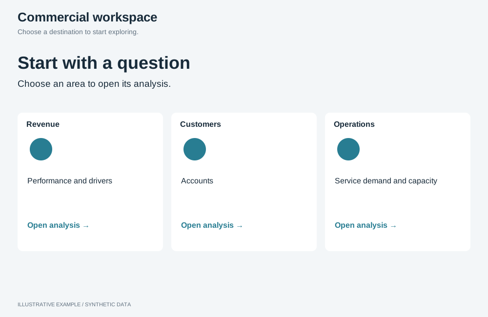
Illustrative example with synthetic data. Choose a destination to start exploring.
When to use a hub layout
Section titled “When to use a hub layout”Use it as the entry page of an app with several views, such as a department portal or the front of a multi-page report.
| The page is mainly | Use instead |
|---|---|
| Headline numbers and the charts that explain them | KPI-led |
| Many cards to compare, not to open | Card grid |
| An argument read top to bottom | Long-form |
Choose a variant
Section titled “Choose a variant”- Does the page only introduce the report and list its pages, with no data? Use cover page.
- Otherwise, use cards.
| Variant | Layout | Use cases |
|---|---|---|
| Cards | 3 or 4 large cards, each one link, optionally with one headline number | Operations app: Shipments, Carriers, Performance. Department portal: Hiring, Headcount, Attrition, Training |
| Cover page | Title, a short description and a list of links | Front of an annual report listing its chapters |
┌──────────────────────────────┐│ Title and one line │├──────┬───────┬───────┬───────┤│ View │ View │ View │ View ││ 1234 │ 98% │ $4.20 │ 12 │└──────┴───────┴───────┴───────┘- Make each card one link, titled with the same words as the destination page’s heading.
- Use 3 or 4 cards: three fold 3 → 1, four fold 4 → 2 → 1. With more pages, group them or use a cover page.
- A live number costs one query per card on load, and again on each applied selection change if it follows selections; see Re-query your own objects only on applied changes. Leave it out when the destination page shows it first.
- Show a failed number on its own card and keep the link usable.
:root {  --card-min: 200px;}
.board {  display: grid;  gap: calc(2 * var(--gap));  align-content: start;}.band {  display: grid;  gap: var(--gap);  min-height: 0;}.band--cards {  grid-auto-rows: minmax(var(--card-min), auto);}.band--cards-3 {  grid-template-columns: repeat(3, minmax(0, 1fr));}.band--cards-4 {  grid-template-columns: repeat(4, minmax(0, 1fr));}.hub-card {  display: grid;  grid-template-rows: auto auto minmax(0, 1fr);  gap: 8px;  padding: 20px;}/* Reserve the number's line, so a card without one, or still loading, keeps its height. */.hub-card__number {  min-height: 1lh;}
/* 280px cards; 15 is a classic scrollbar: 4 × 280 + 3 × 16 + 2 × 16 + 15 = 1215 */@media (width < 1215px) { .band--cards-4 { grid-template-columns: repeat(2, minmax(0, 1fr)); }}/* 3 × 280 + 2 × 16 + 2 × 16 + 15 = 919 */@media (width < 919px) { .band--cards-3 { grid-template-columns: minmax(0, 1fr); }}/* 2 × 280 + 16 + 2 × 16 + 15 = 623 */@media (width < 623px) { .band--cards-4 { grid-template-columns: minmax(0, 1fr); }}| Width | 3 cards | 4 cards |
|---|---|---|
| 1215px and wider | 3 across | 4 across |
| 919–1214px | 3 across | 2 across |
| 623–918px | 1 across | 2 across |
| Under 623px | 1 across | 1 across |
The page scrolls when the card rows are taller than the window.
Cover page
Section titled “Cover page”┌───────────────────────┐│ Title ││ Description ││ › Chapter 1 ││ › Chapter 2 │└───────────────────────┘Mark up the links as a list in reading order. A cover page runs no queries.
.cover { display: grid; gap: var(--gap); /* A readable line length; narrower windows use the full width. */ max-width: 72ch; margin-inline: auto; padding-block: calc(4 * var(--gap));}.cover__links { display: grid; gap: 8px; margin: 0; padding: 0; list-style: none;}