

Filter panel
A filter panel holds the page’s filter objects behind the Filters button in the header. It opens as an overlay drawer, or as a docked column beside the board. A filter bar folds into it when its row runs out of width. The apply bar stays under the header in both variants; see Build an apply bar.
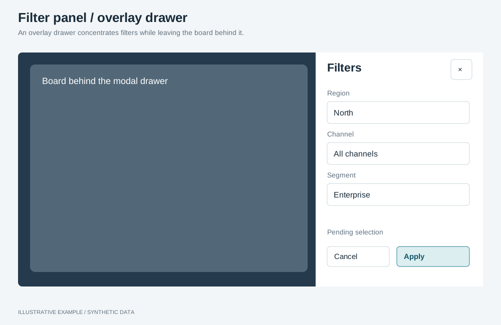
Illustrative example with synthetic data. An overlay drawer concentrates filters while leaving the board behind it.
Choose a variant
Section titled “Choose a variant”- Is the window wide enough to keep the board’s widest tier beside the panel, and do readers filter while they read? Use the docked panel.
- Otherwise, use the overlay drawer.
| Variant | Layout | Use cases | Choose another when |
|---|---|---|---|
| Overlay drawer | A modal panel at the right edge; the board keeps its width | Many filters; filters set once per visit; any page below the docking width | Readers change filters after every look and the window is wide |
| Docked panel | A column left of the board; the board narrows | Analysts adjusting region, product and channel repeatedly on a wide monitor | The window is narrower than the docking width |
Markup
Section titled “Markup”<!-- Overlay drawer: a modal dialog outside the page's grid. --><dialog class="filter-panel filter-drawer" id="filter-drawer" aria-labelledby="filter-drawer-title" closedby="any"> <div class="filter-panel__head"> <h2 id="filter-drawer-title">Filters</h2> <form method="dialog"><button type="submit">Close</button></form> </div> <div class="filter-panel__body"> <div class="filter-host" data-object-id="region-filter@panel"></div> </div></dialog>
<!-- Docked panel: the first child of the page's grid, before the board. --><div class="page"> <aside class="filter-panel filter-dock" id="filter-dock" aria-labelledby="filter-dock-title" hidden> <div class="filter-panel__head"><h2 id="filter-dock-title">Filters</h2></div> <div class="filter-panel__body"><!-- filter hosts --></div> </aside> <main class="board">…</main></div><form method="dialog">closes the drawer without script. Forclosedby="any"and its fallback, see Build it as a<dialog>.- The panel’s filters are their own instances (
@panel), in the same selection group as the bar’s; see Instance identity.
The panel reads --surface, --ink and --line from the style.
:root {  --panel-w: 320px;  --panel-filter-h: 240px;}
.filter-panel__head {  display: flex;  align-items: center;  justify-content: space-between;  padding: 0 var(--gap);  border-bottom: 1px solid var(--line);}.filter-panel__body {  display: grid;  gap: var(--gap);  align-content: start;  padding: var(--gap);  overflow-y: auto;}/* Size the host, not the filter. */.filter-panel__body > .filter-host {  height: var(--panel-filter-h);}
Overlay drawer
Section titled “Overlay drawer”.filter-drawer { box-sizing: border-box; width: min(var(--panel-w), 100vw - 2 * var(--gap)); max-width: none; height: 100svh; max-height: none; margin: 0 0 0 auto; padding: 0; border: 0; border-left: 1px solid var(--line); background: var(--surface); color: var(--ink);}/* Display rules on a dialog only while it is open. */.filter-drawer[open] { display: grid; grid-template-rows: var(--header-h) minmax(0, 1fr);}margin: 0 0 0 auto places the dialog at the right edge; max-width and max-height: none remove
the user-agent limits. See CSS rules that fail silently
for why display is scoped to [open].
Docked panel
Section titled “Docked panel”.page:has(> .filter-dock:not([hidden])) { display: grid; grid-template-columns: var(--panel-w) minmax(0, 1fr); gap: var(--gap);}.filter-dock { display: grid; grid-template-rows: var(--header-h) minmax(0, 1fr); box-sizing: border-box; /* The same height as the board beside it. */ height: calc(100svh - var(--header-h) - var(--above-board, 0px) - 2 * var(--gap)); background: var(--surface); border: 1px solid var(--line);}.filter-dock[hidden] { display: none;}Dock only where the board keeps its widest tier. The docked panel takes --panel-w + --gap from the
board: for a widest tier starting at 1280px, the docking width is 1280 + 320 + 16 = 1616px, plus a
classic scrollbar when the page scrolls.
Behaviour
Section titled “Behaviour”- Closed means unmounted. Mount the panel’s filters when it opens and unmount them when it closes; see Hidden means unmounted.
- Open first, then mount. A closed dialog has no size, so call
showModal()before mounting. - Selections survive closing. They belong to the group, so the apply bar still shows them. Discard clears pending selections; closing does not.
- Use
listboxmode, which has room in the panel, and turn quick select off, as in Configure the filter objects.
// Panel is the lifecycle class from Hidden means unmounted; one per panel instance.declare const panelFilters: { panel: Panel; host: HTMLElement }[];
const trigger = document.querySelector<HTMLButtonElement>('.filters-trigger');const drawer = document.querySelector<HTMLDialogElement>('#filter-drawer');if (!trigger || !drawer) throw new Error('Filters trigger or drawer is missing.');
trigger.addEventListener('click', () => {  drawer.showModal();  trigger.setAttribute('aria-expanded', 'true');  for (const { panel, host } of panelFilters) panel.show(host);});
drawer.addEventListener('close', () => {  for (const { panel } of panelFilters) panel.hide();  trigger.setAttribute('aria-expanded', 'false');});
For the docked panel, toggle hidden on .filter-dock from the same trigger: show its panels after
removing hidden, hide them when setting it. With a filter bar on the page, set
data-filters="docked" on .app at the docking width (a matchMedia change listener) and hide the
bar’s filters; the bar then removes its row and its fold observer returns early. Below the docking
width, hide the dock’s filters and remove the attribute; the next header resize runs the fold
observer again.
showModal() moves focus into the drawer and makes the page inert; Escape and Close close it and
return focus to the trigger. The docked panel is part of the page: Tab moves from the header into it,
then to the board.
Related
Section titled “Related”- Filter bar: the inline row that folds into this panel
- Dialog: other modal dialogs